%201.webp)
02
AI Snaps
.svg)
.svg)
01
Our Work

03
About Us
05
Contact Us
06
Client Success

07
Blogs
08
Careers
Book A Call


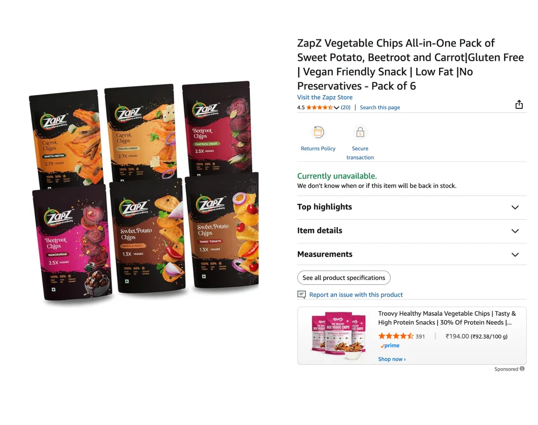
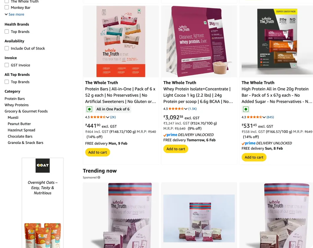
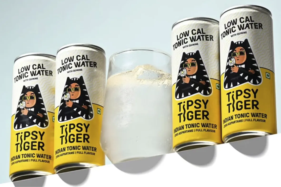
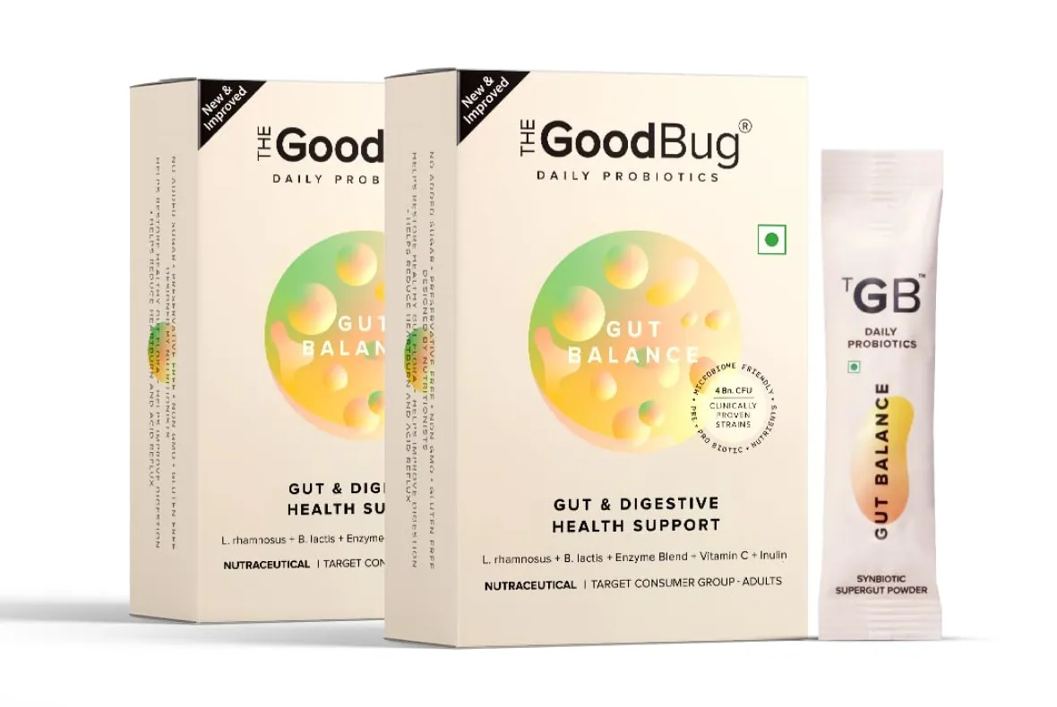
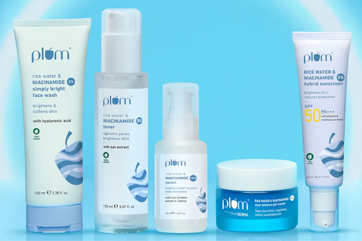
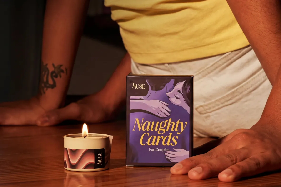
Packaging design for online sales rests on the same strategic foundation as offline packaging, but it has to perform in a completely different environment. On platforms like Amazon, Flipkart, Nykaa, Myntra, and Ajio, products are seen as thumbnails and grid cards, not physical objects, which is why brands such as Plum Skincare, Dot & Key, The Whole Truth, Sleepy Owl, and Mamaearth stand out while scrolling. Plum’s serums and moisturisers use bold colour blocks and high-contrast labels that remain readable at small sizes, Dot & Key relies on strong colour coding to differentiate ranges instantly, and The Whole Truth uses clean typography with minimal clutter so the brand and product type are clear without zooming in. These choices are not about aesthetics alone; they are deliberate packaging decisions made to win attention and recognition in a crowded digital grid.
The most important shift in online packaging design is the loss of physical scale. On an e-commerce platform, a 1 kg pack of protein powder and a 100 g protein powder pack appear almost the same size on screen. Weight, height, and shelf dominance no longer matter. Everything is reduced to a small visual tile, often just a few centimetres wide on a mobile screen.
Brands such as The Whole Truth and Mamaearth focus on strong brand blocks, high-contrast colours, and clear typography so the product is instantly recognisable in a grid. Similarly, a coffee brand like Sleepy Owl designs its packaging to stay bold and legible when placed next to competing coffee products in search results. Online packaging is less about how the pack feels in hand and more about how quickly it communicates category, brand, and value on a screen.
At Confetti, packaging for online sales is designed specifically for how people browse, scroll, and choose products on digital marketplaces. We don’t treat it as an offline pack resized for a screen. The same foundational thinking still applies: material logic for realism and manufacturability, unboxing considerations where D2C deliveries are involved, and a complete packaging system rather than a single flat artwork. But the real difference begins once the Front of Pack is ready.
Every online pack is tested inside platform-specific environments such as Amazon, Flipkart, Nykaa, Myntra, or Ajio, depending on where the product will be sold. We place the client’s product directly next to competing brands from the same category and evaluate it the way a customer would see it: at thumbnail size, inside a grid, surrounded by similar options. This helps us test whether the brand name is readable, the category is instantly clear, and issues that never show up on a clean mockup become obvious here, allowing us to refine the packaging before it goes live.

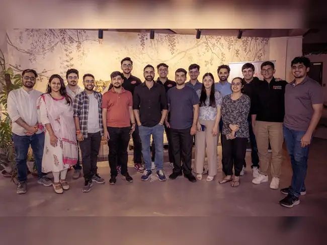
Confetti’s team is trusted by global leaders, and it’s time we join forces with you to create your Iconic brand!
Tap the button below and talk to our founders directly.
.webp)

Packaging for online sales frequently underperforms when it is approved without digital context. Some of the most common mistakes include:
At Confetti, we avoid this by ensuring packaging is not just designed, but tested, visualised, and approved in the exact digital environments where buying decisions are made.
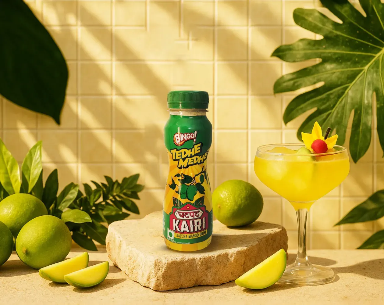
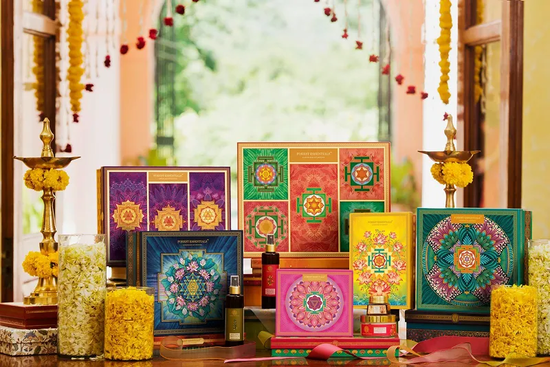
We worked with Bingo (by ITC) to help them launch India’s next viral beverage; Aam Panna
%201.webp)
Global award-winning Identity & packaging design for US's health & lifestyle startup AIM Nutrition
-p-2000%201.webp)
Building India’s fastest growing D2C supplements brand, Miduty by redesigning their branding, packaging & e-commerce website
Packaging for e-commerce has to win attention on a screen before it ever gets held. Unlike retail shelves, every product competes in the same grid, often reduced to a small thumbnail with very little context around it. That means clarity, contrast, and legibility matter far more than subtle detail. Many D2C brands are designed with this in mind from the start. Minimalist, for example, prioritises clear hierarchy and readable typography so the pack still makes sense at a glance on a phone screen.
At Confetti, e-commerce considerations are built in early, so packaging performs in digital environments without compromising the physical experience. If you’re unsure whether your product should be optimised for shelf or screen first, hopping on a short call with our experts can help define where your primary sales channel really sits.
At thumbnail size, packaging has very little time to communicate. Colour contrast, logo clarity, and a simple visual hierarchy become critical, because fine details disappear on smaller screens. If a customer can’t immediately recognise the brand or understand what the product is, they’re unlikely to click through. That’s why strong e-commerce packaging often looks simpler than its retail counterpart.
You can see this approach in brands like Olly, which uses bold colour blocks to stand out even at small sizes. At Confetti, we test packaging at real thumbnail dimensions on app and marketplace screens, not just in mockups. If you want to see how your pack actually performs on a phone screen, hopping on a short call with our team allows us to review it in context.
Packaging that looks great in hand can still struggle online, which is why it needs to be tested in the environments where it will actually be sold. We place mockups into real e-commerce contexts such as Amazon, D2C websites, and category marketplaces to see how they hold up against competitors, pricing cues, and platform layouts. This quickly reveals whether the pack is clear, clickable, and recognisable, or whether it fades into the grid.
At Confetti, this kind of performance testing is built into design validation and usually takes around one week, so issues are caught before launch rather than after. If you want to simulate real e-commerce conditions and understand how your packaging will actually perform on screen, getting on a quick call with our experts is the easiest way to walk through that process.
Yes, the same packaging design can work across both online and offline channels, but only when it’s built as a flexible system rather than a single fixed layout. The core cues need to stay consistent, while details adapt to context. What works on a shelf from three metres away isn’t always what works at thumbnail size, so the design has to stretch without losing recognition.
Brands like Skims do this well by maintaining a strong, minimal visual language that translates cleanly across retail, e-commerce, and social platforms. At Confetti, we design packaging systems that are channel-adaptive from the start, not retrofitted later. If you’re trying to decide whether one packaging system can realistically serve all your sales channels, getting on a short call with our experts can help assess that before design choices are locked in.
Online marketplace testing should happen before final artwork is locked, while there’s still room to adjust without disrupting timelines or budgets. Testing early shows how the packaging performs in real digital environments, where scale, clutter, and platform layouts can quickly expose weaknesses. At Confetti, this testing runs alongside offline checks and usually takes around one week, helping us align both channels before sign-off. If you want to plan this efficiently without slowing the project down, hopping on a short call with our team can help line up the right testing window.


Lorem ipsum dolor sit amet, consectetur adipiscing elit. Suspendisse varius enim in eros
Lorem ipsum dolor sit amet, consectetur adipiscing elit. Suspendisse varius enim in eros
Lorem ipsum dolor sit amet, consectetur adipiscing elit. Suspendisse varius enim in eros
.svg)
.svg)


.svg)
.webp)


.webp)


.webp)


.webp)