%201.webp)
02
AI Snaps
.svg)
.svg)
01
Our Work
03
About Us
04
Brand Audit
05
Contact Us
06
Client Success
12
07
Blogs
08
Careers
Book A Call
.svg)




Need Help In Building Your Brand?
Click the button below & book a call with our founder directly.

Rishabh Jain
Managing Director
Phool | Confetti's Verdict ⭐⭐⭐⭐½
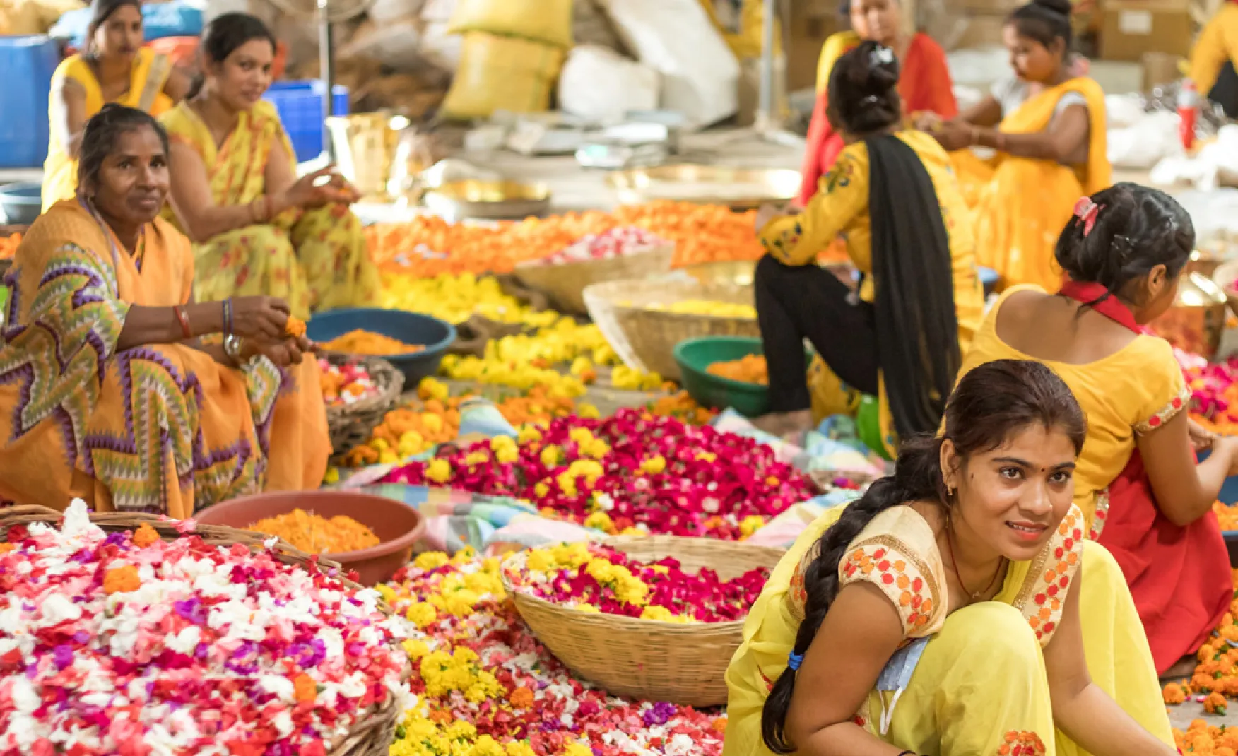
Confetti Design Studio has analysed Phool to understand how a brand that started with a single observation at the ghats of the Ganga grew into India's leading luxury incense brand, recording Rs 77.2 crore in revenue in FY25 after delivering 75% year-on-year growth to Rs 50 crore in FY24. The company has raised USD 12.7 million across nine funding rounds, with investors including Sixth Sense Ventures, IIT Kanpur, Social Alpha, and Alia Bhatt. Its flowercycling process has converted over 11,000 metric tonnes of temple flower waste into products, employing over 500 women from marginalised communities across six processing units.
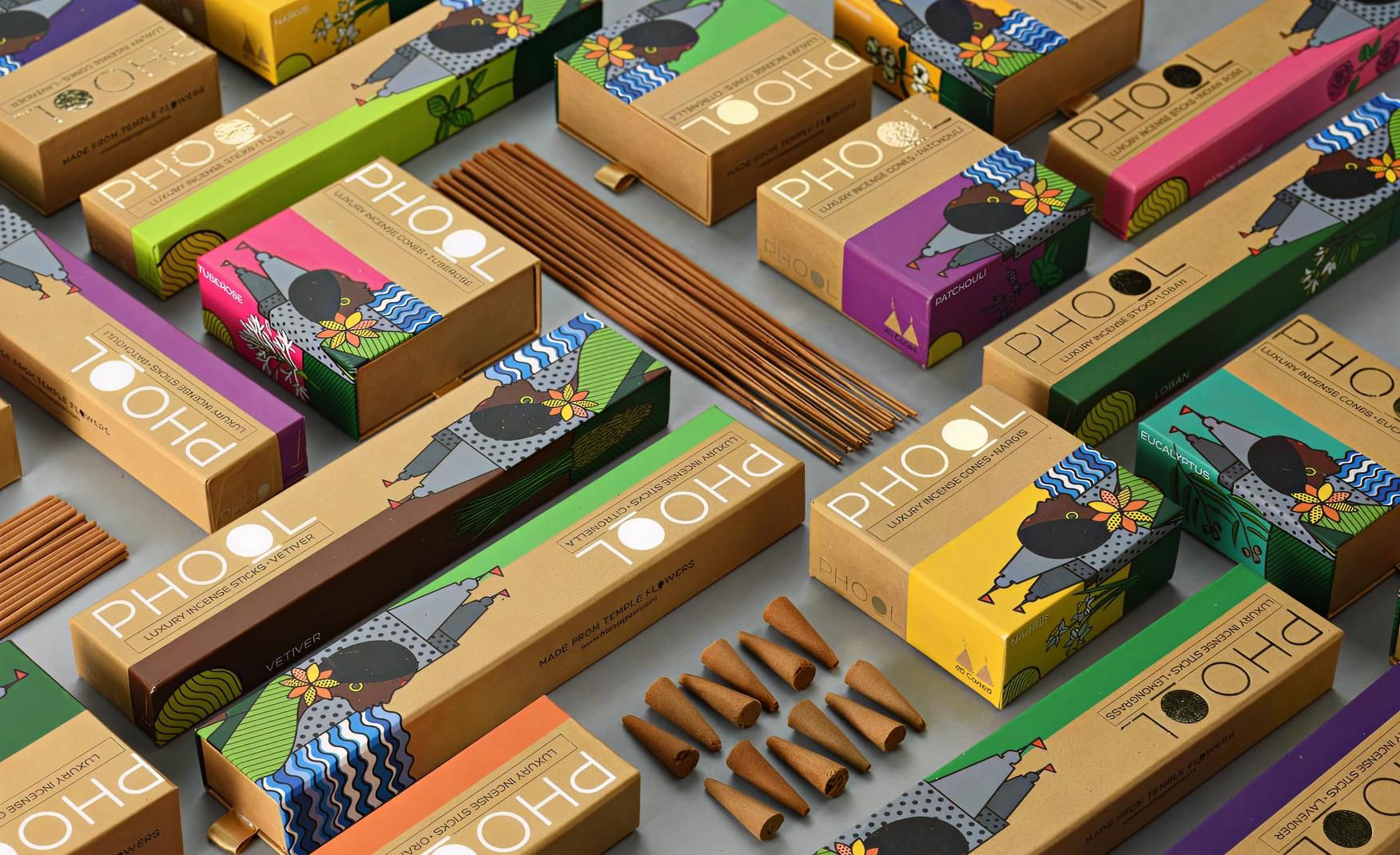
Most brand origin stories are constructed after the fact. A product gets made, a market is identified, and a story is assembled around the commercial decision. Phool's origin works in reverse, and that reversal is the source of its most durable brand equity.
Ankit Agarwal, a computer science graduate and former data scientist at Barclays who had worked on global development projects with the UN and the Bill and Melinda Gates Foundation, visited the ghats in Kanpur and saw the river's surface choked with discarded temple flowers. The flowers were sacred in intent but toxic in practice: laden with pesticides and chemical dyes that leached into the water. He spent the next year and a half researching the problem with Rs 72,000 of his own savings, eventually cracking a process to convert floral waste into charcoal-free incense. What began as an environmental intervention became a product, and the product became a brand.
The commercial consequence of this sequence is significant. Phool did not enter the incense category to compete in incense. It entered to solve a problem and built a product as the mechanism for that solution. Every element of the brand story, the river, the temples, the women workers, the charcoal-free formulation, exists because the founding problem demanded it. There is no gap between the brand narrative and the operational reality. That coherence is impossible to manufacture and extremely difficult to compete with. For the health-conscious, design-aware, sustainability-motivated consumer who makes up Phool's core audience, this origin story is not background information. It is a purchasing reason.

Agarbatti as a product category has structural limitations for a brand with Phool's ambitions. The category skews towards an older demographic and carries strong associations with traditional religiosity that makes it a harder sell to the young, urban, wellness-oriented consumer Phool is targeting. It is also a low-frequency gifting category outside of festival periods, which creates revenue volatility.
Phool's expansion into B2B and B2C gifting, seasonal collections, wellness products, Florafoam (a biodegradable alternative to thermocol), and Fleather (a vegan leather grown from floral waste fibre through a microbial process) is not simply product diversification. It is a systematic expansion of the flowercycling mission into adjacent categories, each of which opens new revenue streams, new brand occasions, and new consumer relationships without requiring Phool to step away from the founding purpose that gives the brand its credibility.
The gifting angle is particularly well-considered. Corporate gifting for Diwali, Holi, New Year, and Christmas allows Phool to access premium B2B budgets at volumes that D2C retail cannot match. Each gifting occasion is also a brand-building event: a recipient who receives a Phool gift set encounters the brand story for the first time through the packaging, the product quality, and the sourcing narrative. That introduction converts into individual purchase more reliably than any paid acquisition campaign.
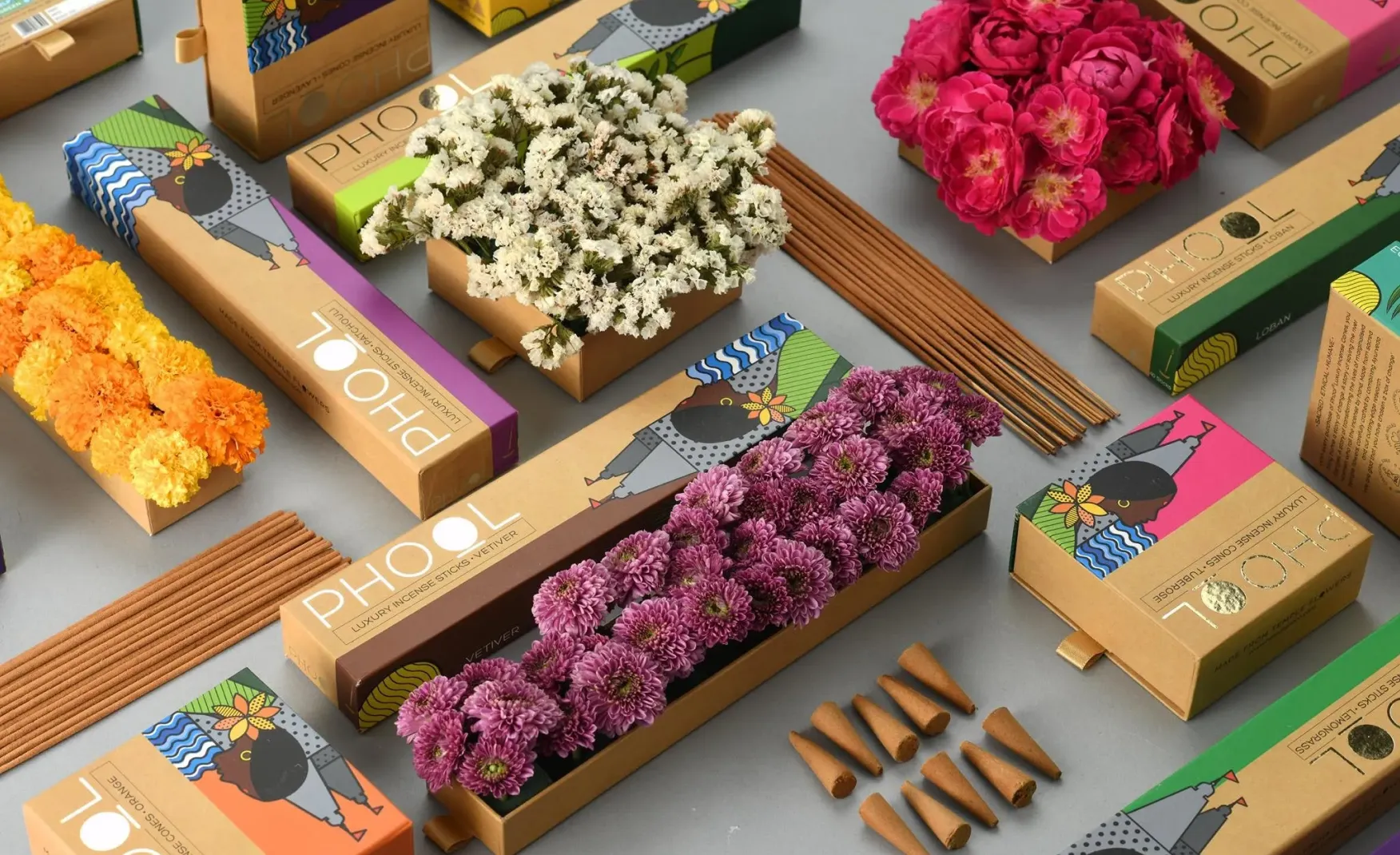
The brands that Phool chooses to collaborate with are not chosen for audience reach alone. They are chosen for the signal that the association sends about Phool's own positioning.
The partnership with The Leela Palaces, where flowers decorating the hotel properties are collected and converted into incense sticks infused with The Leela's signature fragrance, Tishya, places Phool in the same visual and experiential world as one of India's most prestigious luxury hospitality brands. The collaboration was not a co-branded product for sale on a shelf. It was a live demonstration of Phool's process operating inside a five-star environment. For a luxury audience that encounters the incense in a Leela hotel room, the brand association is immediate and unambiguous.
The Radisson Hotels partnership works similarly, as does the reported collaboration with the royal family of Jaipur through Princess Gorvi Kumari. Each of these associations tells a specific story about where Phool belongs in the luxury landscape. The consumer who buys Phool products through Nykaa or Arata encounters a brand that has been validated by hotel chains and royal households. That validation does not need to be communicated in advertising copy. It is implied by the association itself.
The international expansion into Dubai, serving the NRI diaspora market, follows the same logic. Indians living abroad who are willing to pay premium prices for authentic, ethically produced Indian goods respond to a brand whose provenance, process, and story are clearly communicated. The price premium achievable in international markets for this consumer is substantially higher than in the domestic market, and Phool's brand narrative travels without loss of meaning to any Indian diaspora context.
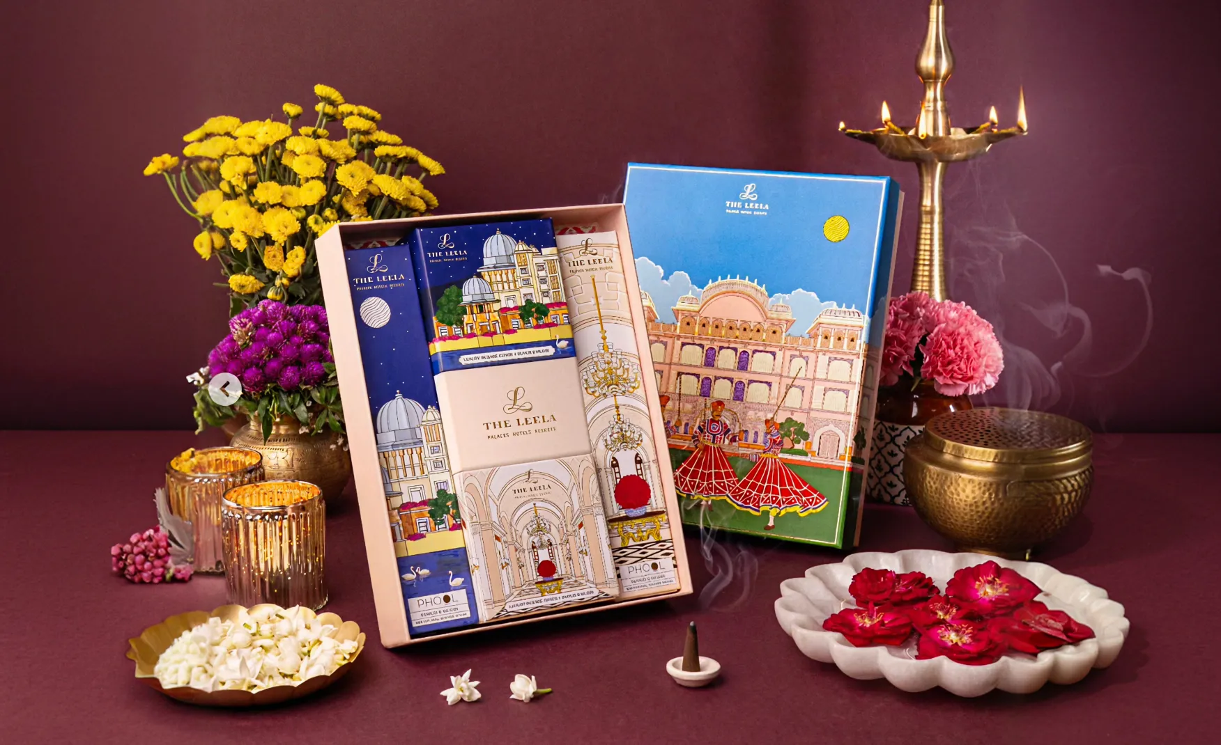
The most commercially important thing Phool's packaging does is communicate luxury without the visual language of conventional luxury. The cork containers for the incense sticks are functionally reusable and visually distinctive in a category where competitors package their products in cardboard tubes, plastic pouches, or paper boxes. Cork reads as natural, tactile, and considered. It is the right material for a brand whose products are made from flower waste by women workers. The packaging does not need to explain the brand's sustainability credentials because the materials make the argument before any copy is read.
The seed paper packaging, which can be buried after use to grow Tulsi, extends this logic into an interactive brand experience. The QR code directing users to a microsite where they can share photos of their growing plant and receive product discounts turns the packaging disposal itself into a community touchpoint. This is a form of customer engagement that most FMCG brands spend significant marketing budget trying to engineer. Phool has built it into the physical product.
The festival packaging, particularly the Diwali range which draws on vintage firecracker visual references, demonstrates a brand that understands how to use nostalgia without becoming kitsch. The design connects to cultural memory while maintaining the brand's ecological commitment. That combination, emotionally resonant and environmentally consistent, is harder to execute than it appears.
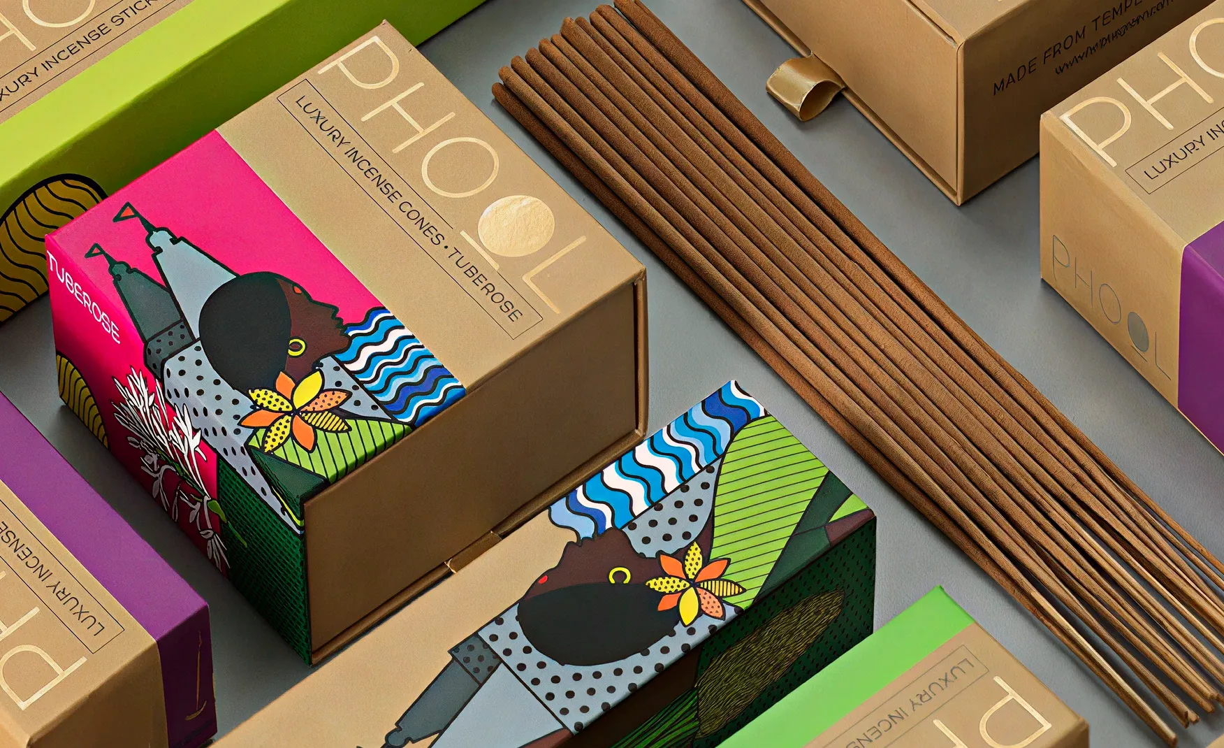
The 500-plus women from marginalised communities, including former manual scavengers, who hand-roll Phool's incense products across six processing units in Kanpur, Varanasi, Ayodhya, and Badrinath are not a CSR footnote. They are a central design element of the brand.
The handcrafted nature of the product is a direct consequence of employing this workforce. And the handcrafted nature of the product is what justifies charging Rs 145 to Rs 165 for incense sticks in a market where conventional products sell for a fraction of that. Veterans in the industry dismissed those price points as impossible when Phool launched. The brand proved them wrong by ensuring that every element of the product story, from sourcing to production to packaging, supported the premium positioning rather than undermining it.
This is a case where social impact and commercial strategy are not in tension. They have the same strategy. The women workforce creates handcrafted quality, the handcrafted quality enables the premium price, the premium price funds the social programme and each element reinforces the next, and the result is a brand where the ethical commitment and the commercial logic are structurally inseparable.
Phool's collaboration record is one of its greatest strengths. It is also, if managed without discipline, the most significant risk to its long-term brand integrity. The collaborations with The Leela and Radisson work because they are selective, aligned with the brand's values, and placed within contexts that reinforce rather than dilute the Phool identity. The concern is what happens as the collaboration pipeline expands. When a consumer's Instagram feed shows Phool with Nykaa, then Phool with Arata, then Phool with a hotel chain, then Phool with a wellness brand, then Phool with an apparel label, the cumulative effect can shift the brand's perception from a brand I trust to a brand that collaborates with everyone. That shift is subtle at first and accelerating once it takes hold.
The reference point here is Forest Essentials, which maintains an extremely selective collaboration policy. The brand does not partner with every premium label that approaches it. It partners with those genuinely aligned with its Ayurvedic luxury positioning, and it does so rarely enough that each collaboration retains significance. Phool needs a similarly explicit framework for what qualifies as a brand-right collaboration, before the volume of partnerships begins to do the work that the brand identity should be doing.
As Phool's product range has expanded, small inconsistencies in the packaging system have begun to accumulate. The choice of language on product names is one example: some fragrances use their Sanskrit or Hindi names, such as Nagchampa, while others use their English botanical equivalents, such as Tuberose, which translates to Rajnigandha in Hindi. For a brand that draws much of its identity from Indian cultural roots, this inconsistency is not trivial. It creates a perceptible break in the visual and verbal system that signals an absence of design rigour.
Colour consistency presents a related challenge. The Tuberose packaging uses a dark red that does not communicate the flower's delicate, pale quality to a consumer who does not already know the fragrance. Colour that contradicts rather than supports the product name creates hesitation rather than desire. These are correctable problems. But they compound if left unaddressed as the range grows further. Building a formal packaging language guide that specifies how fragrances are named, which language register is used, and how colour is selected relative to fragrance character would prevent further drift and strengthen the coherence of the range as a whole.
Phool's development of Fleather, the vegan leather alternative grown from floral waste fibre, is a genuinely innovative biomaterials play that has the potential to become a significant business in its own right. Positioning it within a USD 600 billion leather market is a different scale of commercial ambition than incense. The strategic tension this creates is one of brand architecture. Is Fleather a product of the Phool brand, or is it a separate business that shares a parent company with Phool? The answer to that question determines how both the incense brand and the biomaterials business should be designed, communicated, and positioned. Attempting to hold both under one brand identity creates a risk that neither is communicated with the clarity it deserves. The incense consumer and the fashion brand procurement manager are not the same person and do not respond to the same brand language.
The most urgent brand-building work Phool needs to do is governance, not design. A written collaboration framework that specifies the criteria a partner must meet, the contexts in which the Phool identity can appear alongside another brand, and the visual rules governing co-branded creative would give the brand the discipline it needs to scale its collaboration strategy without diluting the identity that makes those collaborations valuable. Forest Essentials' selective partnership model is the standard to aim for. The goal is for every Phool collaboration to feel like a deliberate editorial choice, not a commercial accommodation.
The naming language and colour selection across the incense range need to be brought under a unified system before the inconsistencies create consumer confusion. This means making a clear policy choice about whether Phool uses Indian language names, English botanical names, or a consistent bilingual approach, and then applying that choice uniformly across the entire range. Colour selection should follow from fragrance character rather than general aesthetic preference: a light floral should never wear a dark heavy colour. These are high-value consistency problems that, once fixed, raise the perceived professionalism of the entire range.
As Fleather moves from innovation story to commercial product, Confetti would recommend an explicit brand architecture audit to determine whether Fleather operates best as a sub-brand of Phool, as a sister brand with its own identity, or as a separate company with a shared parent. What is certain is that attempting to communicate incense luxury and vegan leather supply chain at the same volume, through the same brand identity, will eventually create noise for both. Making that architecture decision clearly, and designing both identities with the appropriate level of independence, will allow each to reach its full potential without the other limiting it.
Phool has done something that very few Indian consumer brands have achieved: it has made the act of buying a product feel like participation in a mission. The incense is charcoal-free and luxury-quality. The packaging is reusable and seed-planted. The production is handcrafted by women who were previously among the most economically marginalised in India. And the raw material is sacred flower waste that would otherwise have contaminated a river. Every element of the commercial model is also an element of the social model, and that structural coherence is the brand's most valuable and most defensible asset.
The challenges are specific and manageable: collaboration discipline, packaging language standardisation, and a clear architecture decision as Fleather scales. None of these undermine what has been built. All of them, if addressed now, protect it. The path from Rs 77.2 crore in FY25 to the kind of scale that befits this brand's ambition runs directly through these decisions.
If you are building a purpose-led, luxury, or sustainability-positioned brand and want to create the kind of packaging system and brand identity that converts a mission into a market position, Confetti can help you build that.
Want strategic branding and packaging like this for your business?





.webp)
.webp)


.webp)
.webp)
.webp)
.webp)
.webp)







.svg)
.webp)





.svg)
.svg)













































































.webp)









.svg)