%201.webp)
02
AI Snaps
.svg)
.svg)
01
Our Work

03
About Us
05
Contact Us
06
Client Success

07
Blogs
08
Careers
Book A Call


Need Help In Building Your Brand?
Click the button below & book a call with our founder directly.

Rishabh Jain
Managing Director
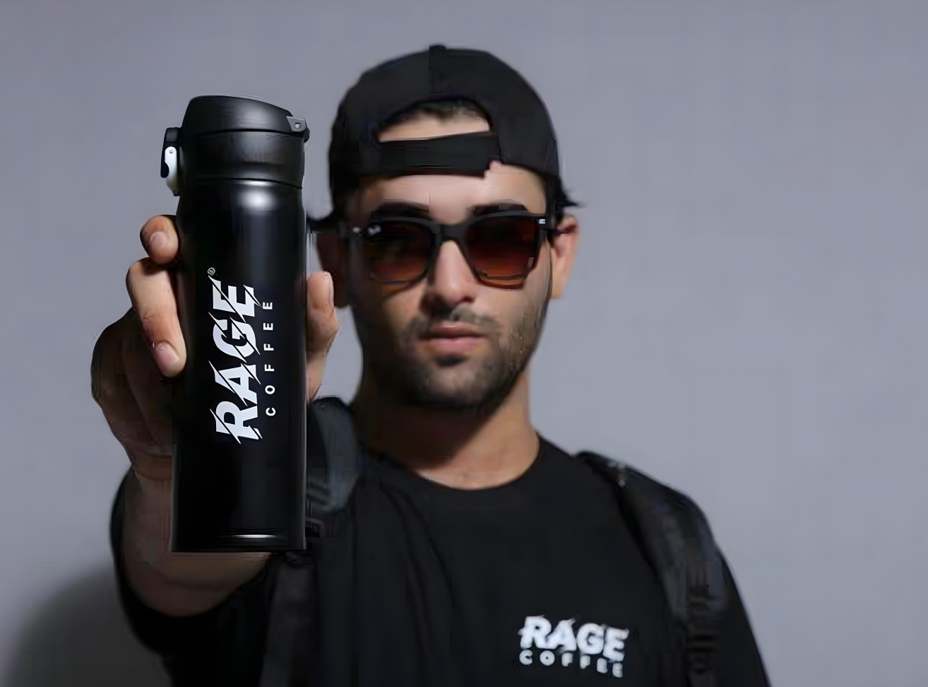
What would you expect from a coffee brand called Rage?
Most people would imagine intensity.
Energy.
Aggression.
A jolt strong enough to wake you up before your alarm does.
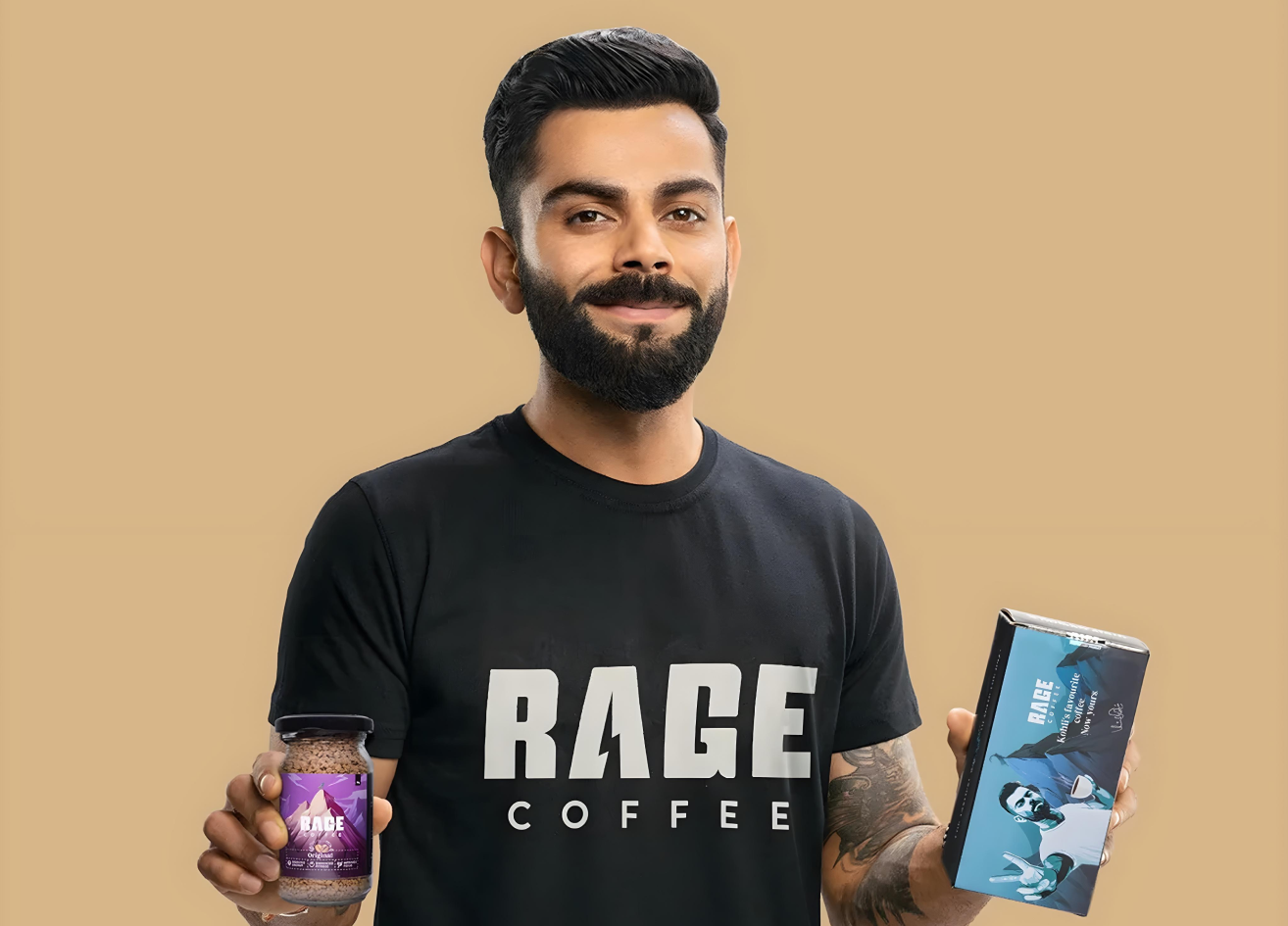
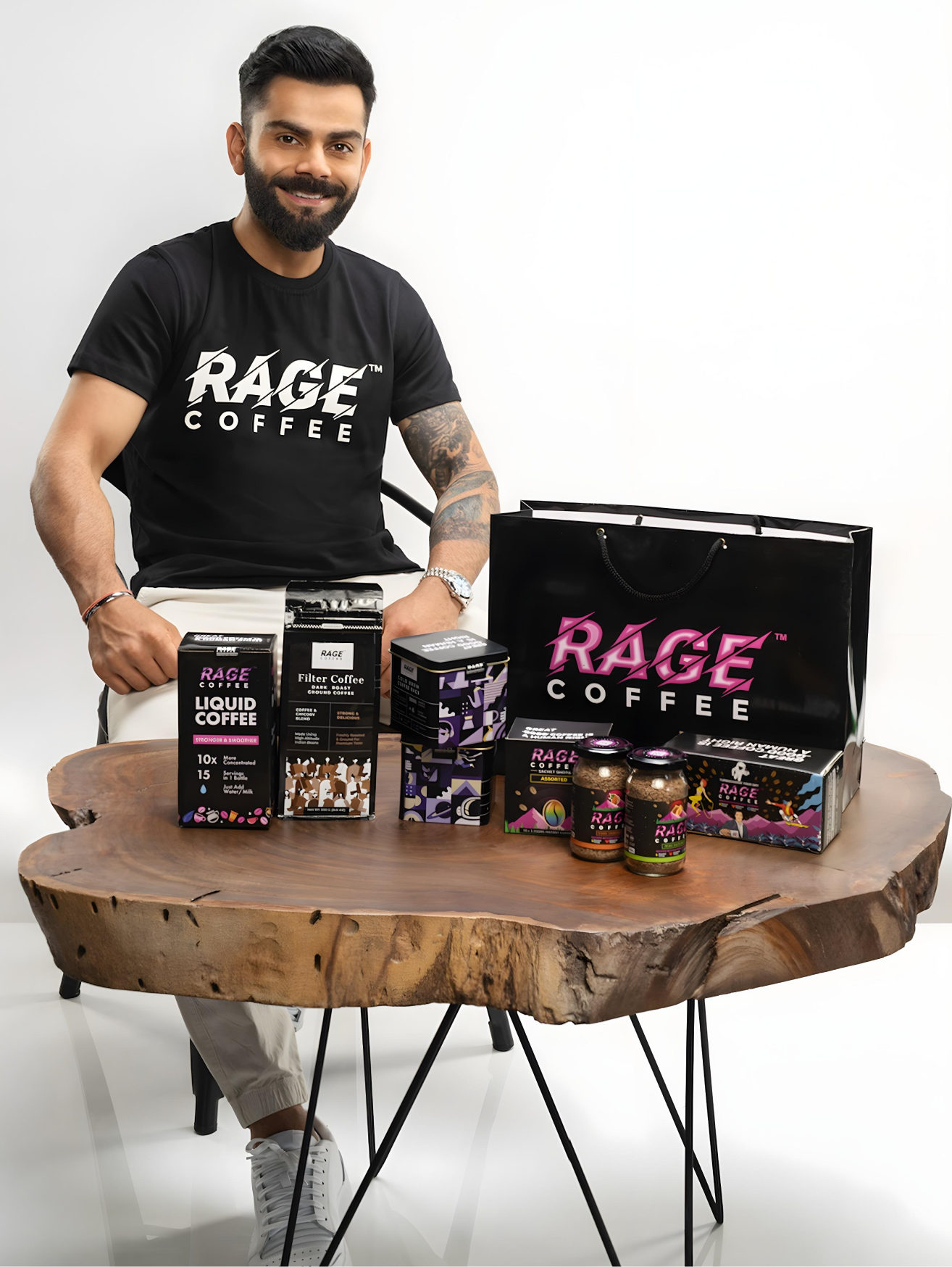
That expectation is not accidental. In the world of consumer brands, names are promises. And this Virat Kohli endorsed brand, Rage Coffee makes a bold statement the moment you hear it.
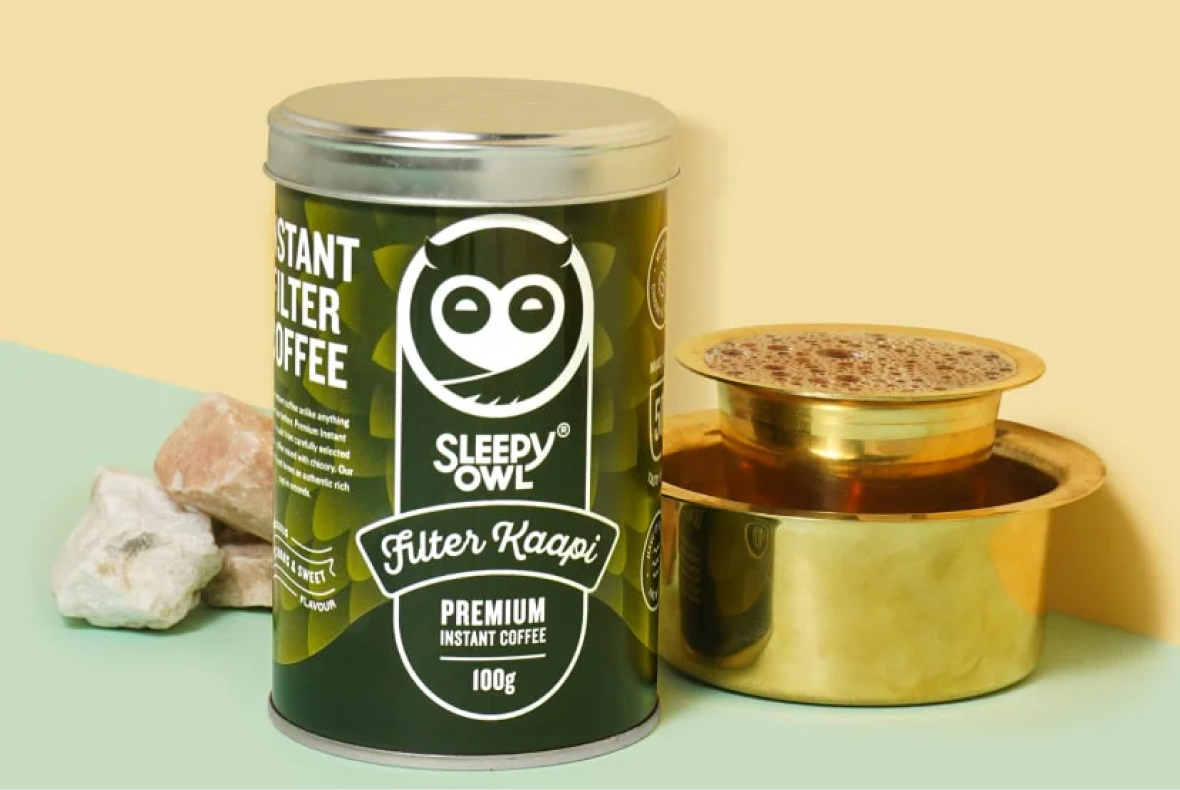
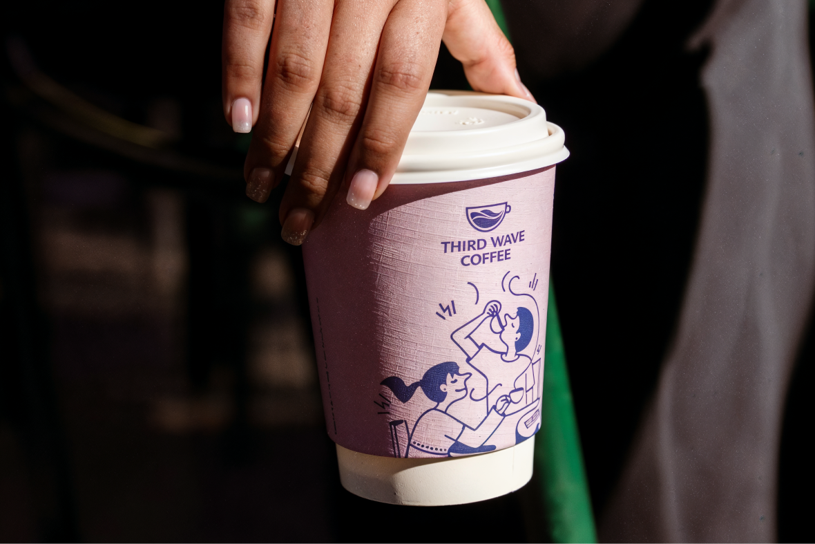
As branding and packaging experts at Confetti, we analysed Rage Coffee not just as another player in the Indian coffee market, but as a brand with one of the most underutilised positions in the category. Competing against brands like Sleepy Owl, Blue Tokai, Rage Coffee, Third Wave, Davidoff, and other premium coffee labels, Rage had the opportunity to own a space no one else in India truly has: caffeine-led aggression.
What makes this audit interesting is not what Rage Coffee is doing wrong in isolation, but how much potential is being left on the table because of internal contradiction.
Rage is a powerful word. In the context of coffee, it signals wakefulness, intensity, and caffeine-driven momentum. It feels physical. It feels fast. It feels like a product you would reach for before a workout, a late-night grind, or a high-pressure day. From a brand strategy standpoint, the name alone sets Rage Coffee apart in a market crowded with calm, artisanal, and lifestyle-focused coffee brands.
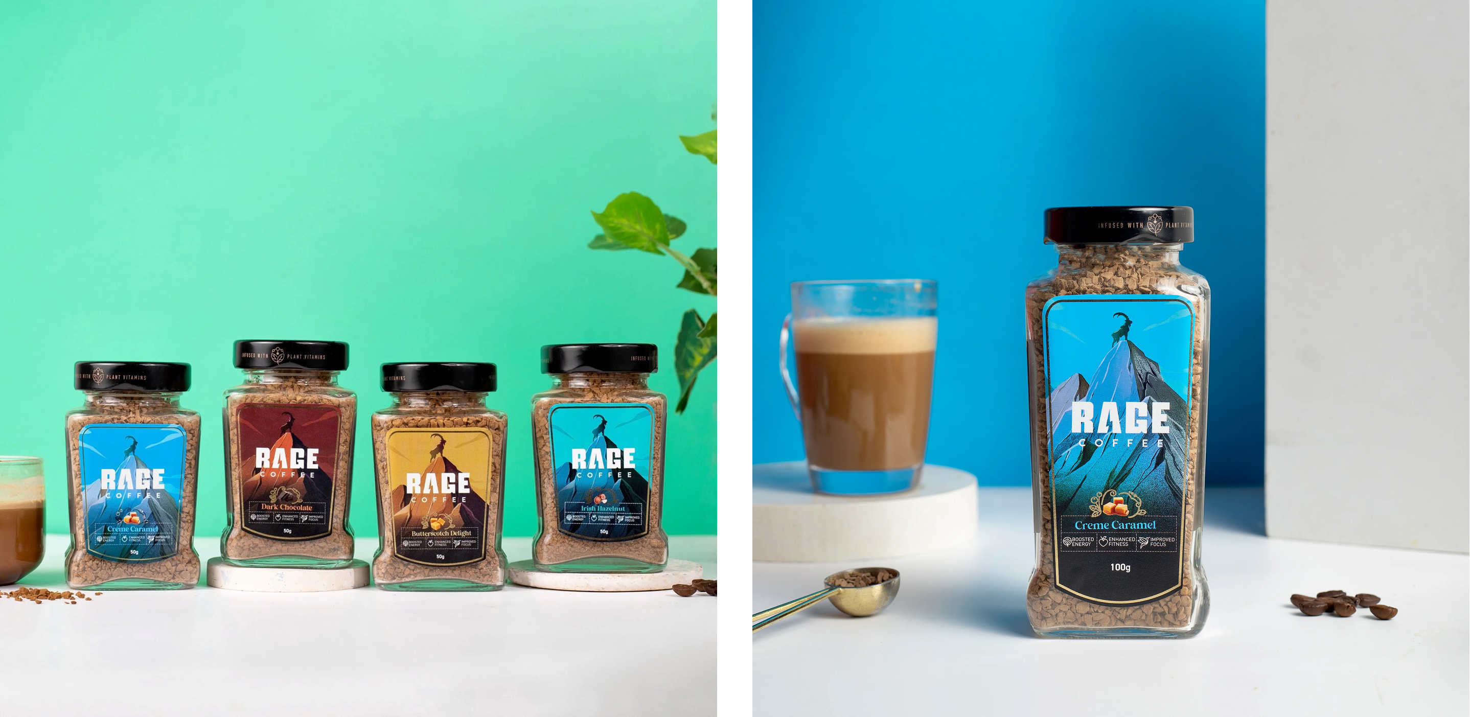
The goat standing atop a mountain is one of the most intelligent brand symbols in the Indian coffee space. On the surface, it communicates energy, dominance, and conquering peaks. But for those familiar with coffee history, it goes deeper.
Coffee was discovered in Ethiopia when a farmer noticed his goats becoming unusually energised after chewing coffee berries. Rage Coffee’s goat icon is a direct nod to that origin story. This layered symbolism shows thought. It rewards curiosity. It tells us the brand understands coffee culture, not just coffee marketing. So on paper, this is definitely a strong foundation.
This is exactly where Rage Coffee begins to lose its entire essence.
Rage promises aggression.
But the product names whisper luxury.
Creamy Hazelnut.
Vanilla Velvet.
Belgian Chocolate.
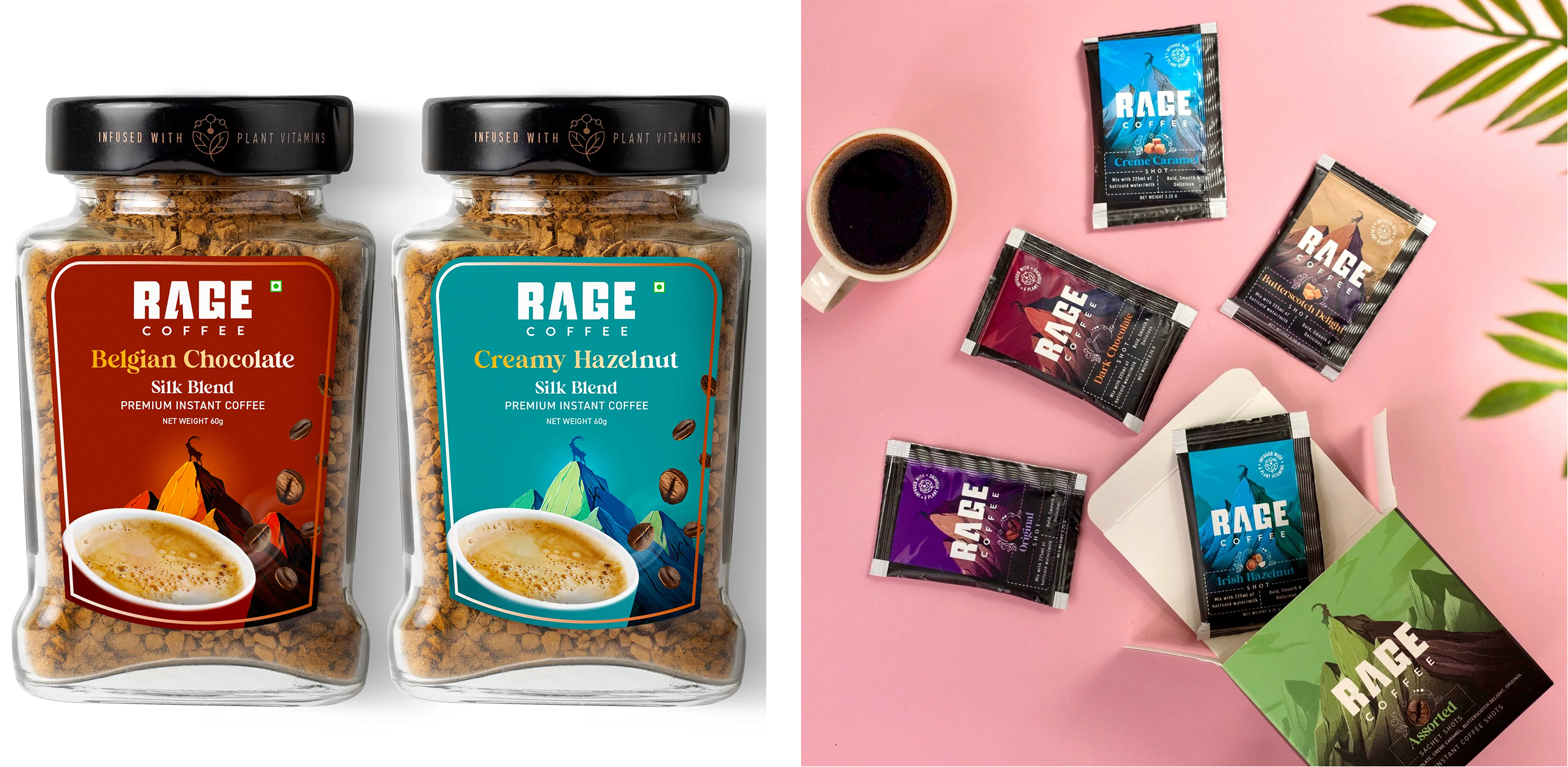
These are indulgent, dessert-led cues. They feel refined, smooth, and premium. They do not feel like rage. They feel like a completely different brand archetype.
If a consumer encounters Rage Coffee for the first time, the brand name suggests one experience while the product names suggest another. That friction creates enormous confusion in the minds of the end consumers of Rage Coffee.
Across the website and packaging, Rage Coffee places heavy emphasis on ethical sourcing, plant extracts, and ingredients like L-theanine, Panax ginseng, Bacopa monnieri, and Ginkgo biloba.
While this information is valuable, it pushes the brand into an artisanal, wellness-adjacent space. That directly contradicts the expectation set by the name Rage.
For a first-time buyer, Rage feels like a coffee you would take before the gym or during a late-night work sprint. Instead, the communication leans toward calm, ethical, premium reassurance. The brand is trying to live in two worlds at once. Aggression and luxury rarely coexist without a very clear narrative bridge. That bridge is currently missing completely from here.
This contradiction becomes even more visible on the packaging itself. Floral patterns and decorative elements dilute the energy that the brand name works so hard to create.

Had this design language belonged to a differently named brand, it would make sense. But under the Rage Coffee name, it feels misaligned. The issue is not that the packaging is bad. It is that it is inconsistent.
India does not yet have a coffee brand that fully owns the aggression, caffeine-first positioning. Everyone is chasing balance, craft, and calm sophistication.
Rage Coffee already has the hardest part done.
The name.
The metaphor.
The energy.
What is missing is the sheer commitment.
Instead of leaning fully into the aggression category, the brand has softened itself into something safer. As a result, it ends up competing with everyone instead of standing apart from them.
Our branding and packaging experts at Confetti rate Rage Coffee a 3.5 out of 5.
This score reflects not a lack of capability, but a lack of alignment. The contradiction between the brand name, product naming, packaging design, and communication strategy is too visible to ignore. Had Rage Coffee committed fully to one direction, especially the aggression-led caffeine space, it could have owned a category that remains largely untapped in India.
A strong contrast can be seen in our work with ITC Bingo Aampanna. That brand was Indian through and through. The name, the flavour, the visual language, the product, and the tone all spoke the same cultural language. Nothing contradicted anything else.
That consistency is what Rage Coffee currently lacks.
Neither creativity nor ambition, but definitely lacks coherence.
Confetti is a branding and packaging agency that helps brands find clarity before chasing scale and flying off the shelves. We work with consumer brands to align strategy, design, and storytelling so that every touchpoint reinforces the same promise.
If you are rethinking your brand direction, packaging language, or category positioning, for launching a coffee or tea or any beverage brand, the link to book a call is right beside this article.
Want strategic branding and packaging like this for your business?


Lorem ipsum dolor sit amet, consectetur adipiscing elit. Suspendisse varius enim in eros
Lorem ipsum dolor sit amet, consectetur adipiscing elit. Suspendisse varius enim in eros
Lorem ipsum dolor sit amet, consectetur adipiscing elit. Suspendisse varius enim in eros
.svg)
.svg)


.webp)
.webp)


.webp)
.webp)
.webp)
.webp)
.webp)


.svg)
.webp)
.svg)
.webp)


.webp)


.webp)


.svg)