%201.webp)
02
AI Snaps
.svg)
.svg)
01
Our Work

03
About Us
05
Contact Us
06
Client Success

07
Blogs
08
Careers
Book A Call


Need Help In Building Your Brand?
Click the button below & book a call with our founder directly.

Rishabh Jain
Managing Director
The Indian skincare category has changed dramatically over the last decade. What was once dominated by legacy herbal brands and international imports is now crowded with homegrown players competing for trust, shelf space, and daily relevance. Brands like Plum, Minimalist, Mamaearth, Dot & Key, Forest Essentials, Kama Ayurveda, and global names like The Ordinary and Rhode all operate within the same consumer mindset, but with very different promises.
Plum Skincare sits in a particularly interesting position. It is not aspirational luxury, and it is not traditional Ayurveda. Instead, it has consciously positioned itself as the dependable, modern, everyday skincare brand for India.
As branding and packaging experts at Confetti, we analysed Plum not as a challenger brand anymore, but as a category staple. The question is no longer whether Plum belongs in the Indian skincare conversation. It clearly does. The more important question is how far the brand can go, and what design choices will define its next phase of growth.
Plum is an excellent brand name. There is no second thought about it.
It is short, familiar, easy to pronounce, and almost impossible to forget. It is a real word, which instantly makes it feel approachable. There is nothing intimidating, clinical, or exclusionary about it.
At a subconscious level, the name also plays into the skincare promise itself. Plump skin. Healthy skin. Nourished skin. The association is soft, positive, and universal. This makes Plum feel friendly even before a customer picks up a product. In a category where many brands rely on complicated science-led names or overly traditional cues, Plum’s simplicity becomes its strength.
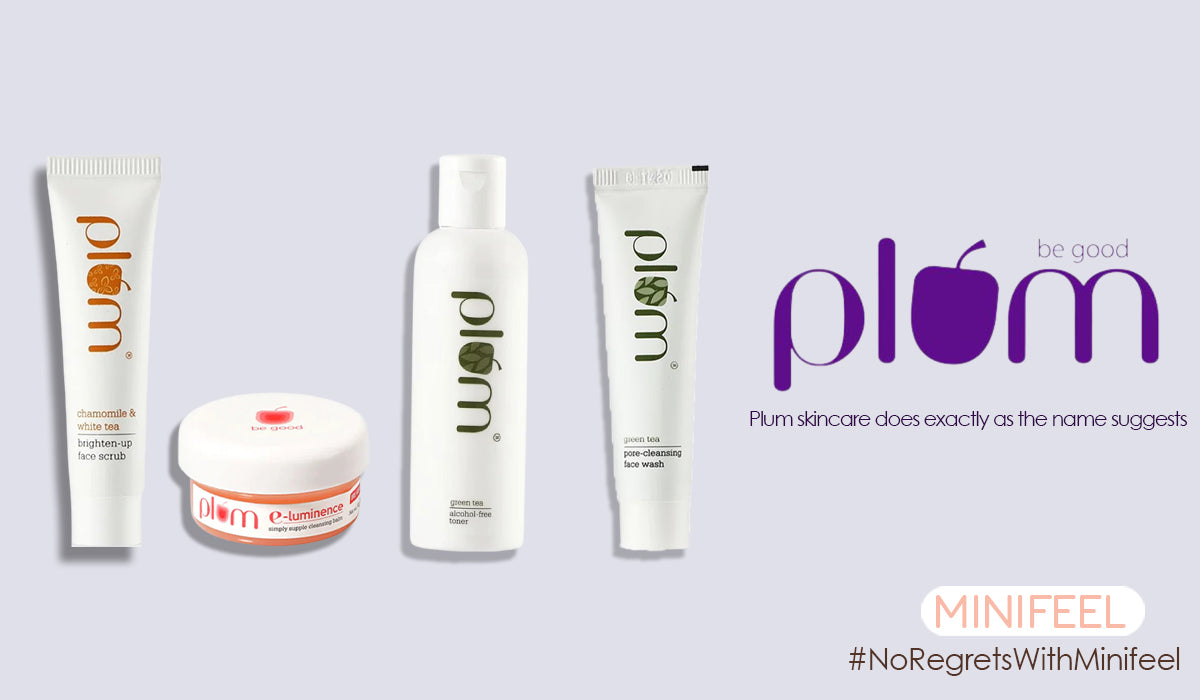
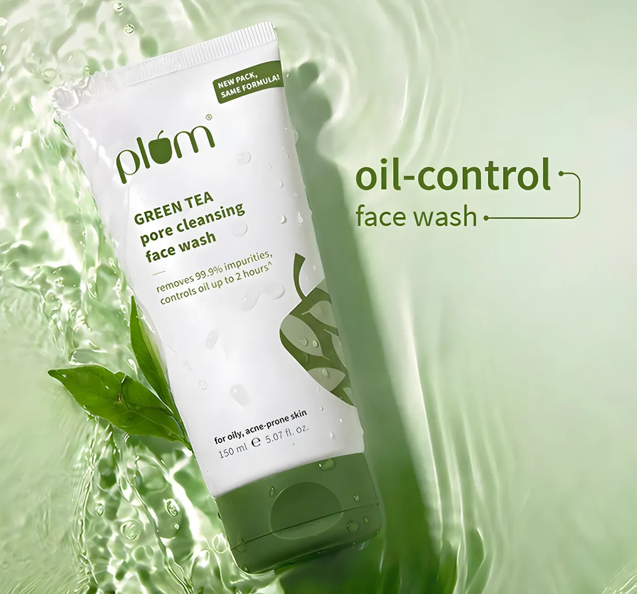
Plum’s packaging design follows the same philosophy as its name. Clean. Minimal. Approachable. The colour palette is carefully chosen. Shades of blue, purple, green, and coffee tones are used across categories to differentiate products while maintaining coherence. Nothing feels aggressive. Nothing feels overly medicinal. This balance makes Plum feel reliable, especially for customers who are still learning about skincare.
Importantly, Plum does not try to position itself as elite or unattainable. It is not trying to mimic luxury brands, nor does it lean heavily into Indian heritage the way brands like Forest Essentials or Kama Ayurveda do. Instead, Plum positions itself as the go-to Indian skincare brand that feels honest and straightforward.
This middle-ground positioning is intentional, and it works.
One of Plum’s biggest strengths lies beyond packaging. The brand communicates consistently and confidently across platforms.
With over a million followers on Instagram, Plum has mastered the art of skincare education without sounding preachy. The brand collaborates with credible creators, uses UGC effectively, and explains routines, ingredients, and usage in a way that feels accessible.
Plum has also shown a willingness to explore newer tools like AI-generated visuals, but it does so carefully. AI is used as an enhancement, not a shortcut. The output still aligns with the brand’s visual language and does not feel disconnected from reality. This consistency across packaging, website, and social media reinforces trust. Customers know what to expect from Plum, and that predictability is valuable in skincare.
While Plum’s packaging is clean and functional, this is also where the brand begins to feel safe.
The product containers themselves are largely generic. Bottles, jars, and tubes follow standard industry silhouettes. If Plum’s label were removed and replaced with another brand’s label, it would be difficult to identify the product by shape alone.
This is not a failure. Many successful brands operate this way. But it is a limitation.
In categories like skincare, shape can become a powerful differentiator. Brands like Kama Ayurveda, Rhode, and even global FMCG players have invested in distinct silhouettes that become recognisable at a glance. Shape builds memory in ways labels cannot. Plum’s current packaging relies heavily on graphics and colour for differentiation. That takes the brand far, but not all the way.
Unique packaging shapes are not mandatory, but they are often what takes a brand from strong to iconic.
At Plum’s scale, this becomes less about aesthetics and more about long-term brand equity. A distinctive silhouette creates recall on shelves, in bathrooms, and in social content. It makes the product identifiable even when branding is partially obscured.
Right now, Plum feels like a well-designed label on a standard bottle. With a more intentional approach to form, it could become a product people recognise instantly without reading a word. This is exactly where the brand can evolve next.
Our branding and packaging experts at Confetti rate Plum Skincare a 4 out of 5.
Plum has built an exceptionally strong foundation. The name works. The design is trustworthy. The communication is clear. The brand has earned its place as a staple in Indian skincare. The remaining one point lies in physical differentiation. Specifically, in exploring original packaging silhouettes that make Plum recognisable beyond colour and label.
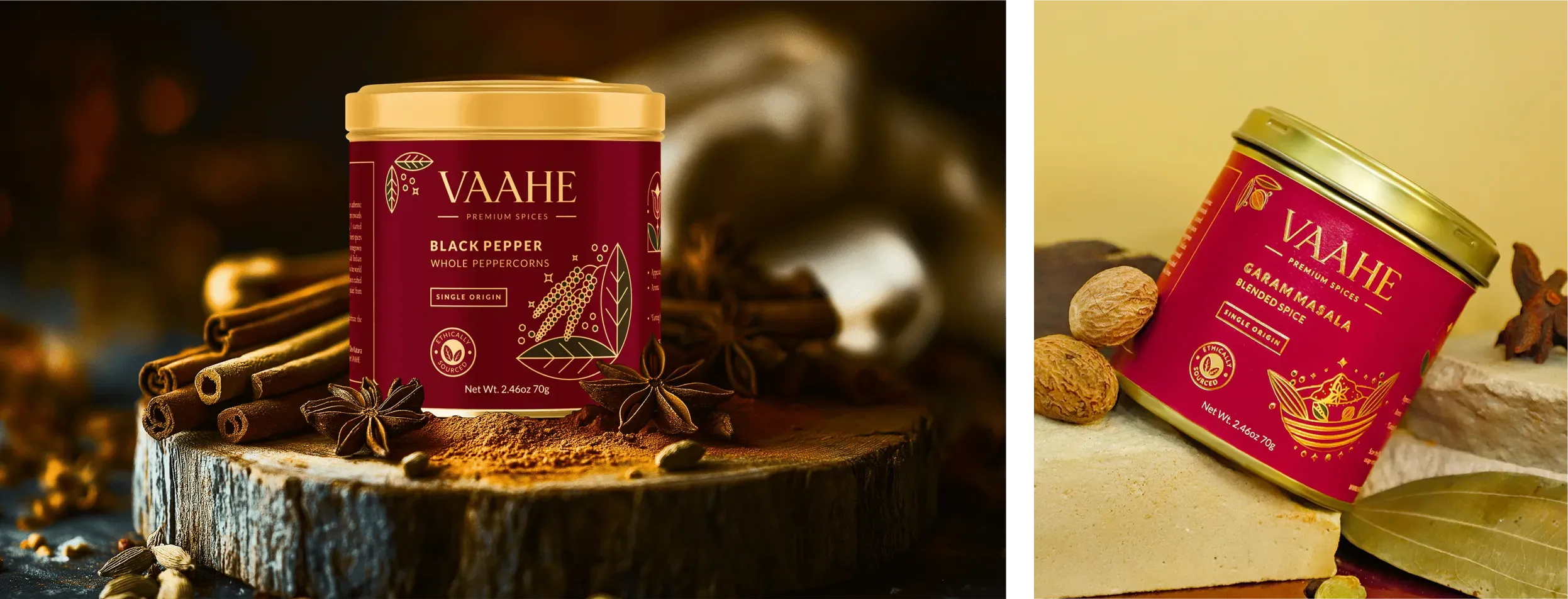
A useful comparison is our work with Vaahe, a premium spice brand. In a category dominated by pouches and cardboard boxes, we introduced aluminium tin packaging. That single decision reshaped how the brand was perceived. Vaahe became the spice brand
Globally, brands like Toblerone, Pringles, and Kinder Joy achieved instant recall largely because of shape. Their silhouettes became assets. Plum has the scale, credibility, and consistency to do something similar in skincare if it chooses to.
Confetti is a branding and packaging agency that helps consumer brands move from familiarity to memorability. We specialise in brand identity, packaging systems, and product architecture designed for long-term growth.
If you are refining your skincare brand’s portfolio or preparing for the next phase of brand evolution, the link to book a call is right beside this article.
Want strategic branding and packaging like this for your business?


Lorem ipsum dolor sit amet, consectetur adipiscing elit. Suspendisse varius enim in eros
Lorem ipsum dolor sit amet, consectetur adipiscing elit. Suspendisse varius enim in eros
Lorem ipsum dolor sit amet, consectetur adipiscing elit. Suspendisse varius enim in eros
.svg)
.svg)


.webp)
.webp)


.webp)
.webp)
.webp)
.webp)
.webp)


.svg)
.webp)
.svg)
.webp)


.webp)


.webp)


.svg)