%201.webp)
02
AI Snaps
.svg)
.svg)
01
Our Work

03
About Us
05
Contact Us
06
Client Success

07
Blogs
08
Careers
Book A Call


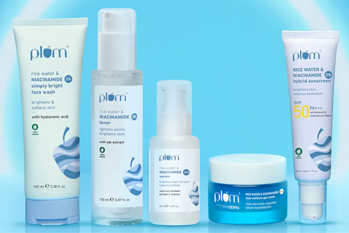
Logo design plays a critical role in how a brand is recognised and remembered as it scales. For many modern Indian brands, the logo becomes the most consistent marker of identity across platforms. Brands like Zomato, boAt, Nykaa, Dot & Key, The Whole Truth, Plum Skincare, Sleepy Owl, and Chumbak have built strong recall not just through communication, but through logos that translate seamlessly across apps, packaging, social media, and physical environments. In each of these cases, the logo acts as a visual shortcut, helping customers identify the brand instantly, even before engaging with the product or messaging.
A logo is the visual representation of a brand and plays a central role in brand identification. While colours, fonts, and icons contribute to brand recall, they are not sufficient on their own. Multiple brands can share similar colours or type styles. For instance, red is used by Coca-Cola, McDonald’s, Airtel, and several other brands, yet each is recognised distinctly because of their logo.
Brands like Zomato, boAt, Nykaa, Dot & Key, The Whole Truth, Plum Skincare, Sleepy Owl, and Chumbak have built strong recall not just through communication, but through logos that translate seamlessly across apps, packaging, social media, and physical environments. In each of these cases, the logo acts as the face of the brand, allowing customers to identify the brand instantly, even before engaging with the product or messaging, regardless of the context in which it appears.
At Confetti, colour and font decisions are not made in isolation. Once a visual direction is established through mood boards, we explore different hues, saturation levels, and tints to build a colour system that aligns with the brand’s personality and positioning. Rather than finalising a palette on swatches alone, we apply these colours and fonts to real use cases early in the process.
This includes creating dummy social media posts, packaging mock-ups, and basic marketing assets using proposed colour and font combinations. Seeing these elements in context allows both the team and the client to evaluate decisions based on how the brand will actually appear in the real world. The same approach is followed for typography, ensuring that readability, hierarchy, and tone are tested across formats before final approvals. This method grounds decision-making and significantly reduces ambiguity later in the design process.
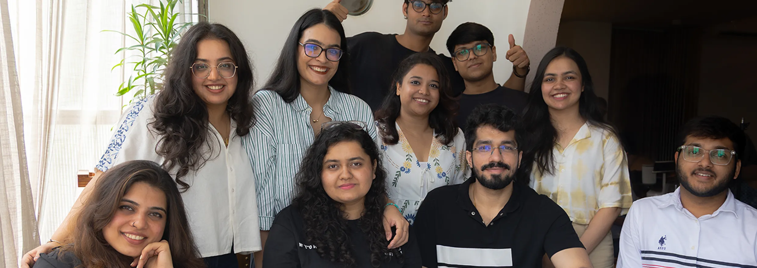
Confetti’s team is trusted by global leaders, and it’s time we join forces with you to create your Iconic brand!
Tap the button below and talk to our founders directly.
.webp)

Logo design often runs into problems when it is evaluated superficially or rushed. Some common mistakes include:
A well-designed logo is not just visually appealing. It is legally sound, strategically aligned, and capable of scaling across every context in which the brand appears.
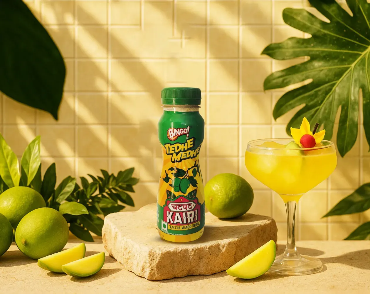
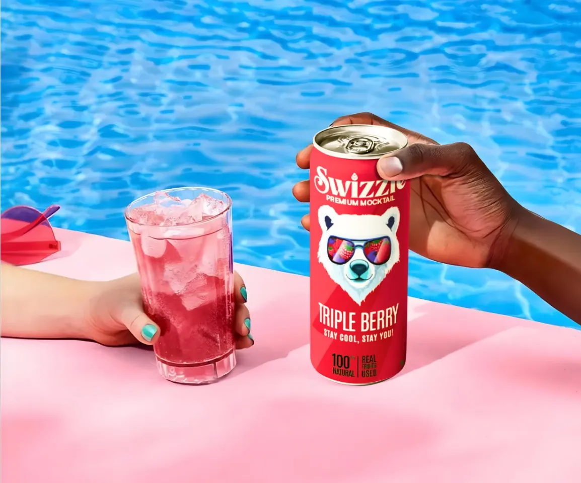
We worked with Bingo (by ITC) to help them launch India’s next viral beverage; Aam Panna
%201.webp)
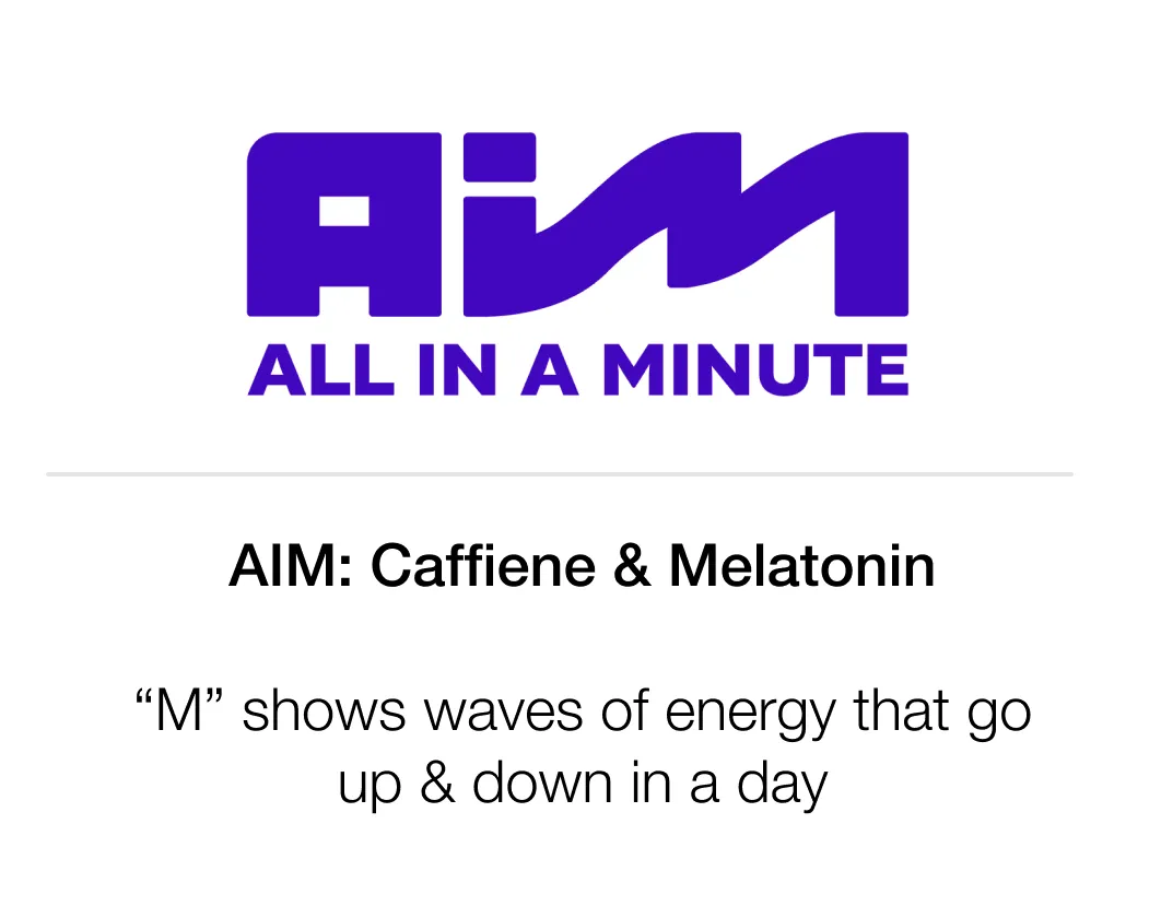
Global award-winning Identity & packaging design for US's health & lifestyle startup AIM Nutrition
-p-2000%201.webp)
Building India’s fastest growing D2C supplements brand, Miduty by redesigning their branding, packaging & e-commerce website
A logo isn’t just a visual mark; it’s a strategic signal. It carries what the brand stands for and how it wants to be perceived long before anyone reads a word. When logo design is treated purely as decoration, it often looks good in isolation but fails to support the brand’s positioning in the real world. The strongest logos are built around meaning and intent, not just aesthetics.
You can see this in brands like Minimalist. Its logo reinforces trust and clarity through restraint, rather than trying to impress visually. At Confetti, logo strategy and research always come before sketching, so design choices are rooted in purpose from the start. If you’re unsure what your logo actually needs to communicate, our team can help you unpack that in a focused call along with you.
Choosing the right logo style starts with context, not preference. We look at what the category already signals, what the audience responds to, and how the brand wants to come across emotionally. A logo doesn’t exist in isolation. It sits next to competitors, appears across real touchpoints, and needs to feel appropriate for the brand’s personality, whether that’s confident, understated, bold, or accessible.
A good example is Skims. Its clean sans-serif wordmark was a deliberate choice to feel modern and approachable, especially when compared to more traditionally glamorous brands like Victoria's Secret. At Confetti, we usually define logo direction within three to five days, once the strategic inputs are clear. If you’re weighing different logo styles and are unsure which one truly fits your brand, this is something we can help you evaluate properly by talking it through together on a short call.
A logo only proves its strength once it’s taken out of the design file and put into real situations. That’s why we test for scalability, legibility, and contrast across a wide range of sizes and formats. A mark should work just as confidently on a billboard as it does in a social media icon, on packaging, or in a website header. If it only looks good at one size or in one context, it’s not doing its job.
At Confetti, this kind of testing is built into every logo presentation and usually takes three to four days. We actively check how the logo behaves across touchpoints, backgrounds, and use cases before anything is signed off. If you want to see how we pressure-test logos in practice and what we look for before approving a direction, our team can walk you through the process in a short discovery call.
Trademark and legal checks should happen once the logo direction is finalised, but before it’s made public. This is the point where the design is stable enough to validate properly, without locking the brand in too early. Many brands make the mistake of skipping this step until after launch, only to realise changes are no longer simple and revisions become expensive, slow, or legally risky.
At Confetti, we support this stage by connecting you directly with our legal partners, who review the logo from a trademark and usage perspective before anything goes live. This helps avoid back-and-forth later and gives you confidence that the identity you’re investing in is safe to use long term. If you’re unsure when or how to approach legal checks for your logo, we can walk you through the exact process and timelines in a call tailored to your project.
A logo needs to strike a balance. It should be flexible enough to adapt across formats, platforms, and future use cases, while still staying recognisable at every stage. If a logo is too rigid, it starts to break as soon as the brand expands. If it’s too loose, it loses consistency and impact. The strongest logos are built to hold their shape while quietly adjusting to different contexts.
You can see this in brands like Glossier. Its logo remains simple and familiar, yet adapts easily across packaging, digital interfaces, and retail environments without losing its identity. At Confetti, we design logos using modular thinking, so they work as part of a system rather than a single fixed mark. If you’re thinking about how your logo will hold up as the brand grows, this is something we can assess together by looking at your future use cases in a focused call with our team.


Lorem ipsum dolor sit amet, consectetur adipiscing elit. Suspendisse varius enim in eros
Lorem ipsum dolor sit amet, consectetur adipiscing elit. Suspendisse varius enim in eros
Lorem ipsum dolor sit amet, consectetur adipiscing elit. Suspendisse varius enim in eros
.svg)
.svg)


.svg)
.webp)


.webp)


.webp)


.webp)