%201.webp)
02
AI Snaps
.svg)
.svg)
01
Our Work

03
About Us
05
Contact Us
06
Client Success

07
Blogs
08
Careers
Book A Call


WhatABite was founded by Tushara Datla, a 22-year-old culinary student turned entrepreneur, to solve a problem many face finding snacks that are both delicious and protein-rich. Tired of supermarket aisles filled with oily, carb-heavy options, she began experimenting in her kitchen. After countless trials and taste tests, she perfected crispy chicken chips with 50% protein, followed by chicken-coated peanuts a unique, flavorful twist that combines crunch with wholesome nutrition. These innovations formed the foundation of a brand built on balance: bold taste and real protein.
Turning this idea into a business required resilience and support. With the ICAR-NMRI incubation programand trusted partners, WhatABite grew from a home experiment into a promising food brand. Today, its mission is clear: to create snacks that bring indulgence and wellness together. From protein-packed chicken chips to crunchy chicken-coated peanuts, and with chicken-based noodles on the way, WhatABite is redefining snacking for every moment midnight cravings, busy workdays, or simply enjoying guilt-free flavor anytime.
.webp)
The WhataBite brand pops with a primary palette of Habanero Orange and Mango Yellow, balanced by Vanilla Cream and Deep Ocean Blue for detail. This vibrant core is strategically amplified by secondary colours, creating essential contrast and versatility. The result is a dynamic visual identity designed for maximum engagement across all brand touchpoints.
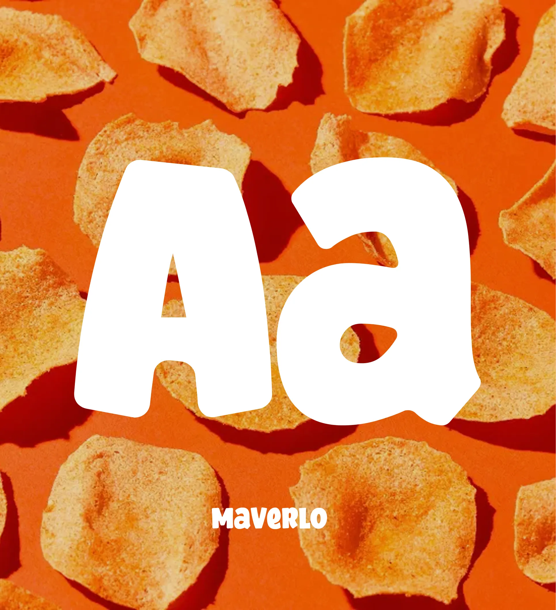
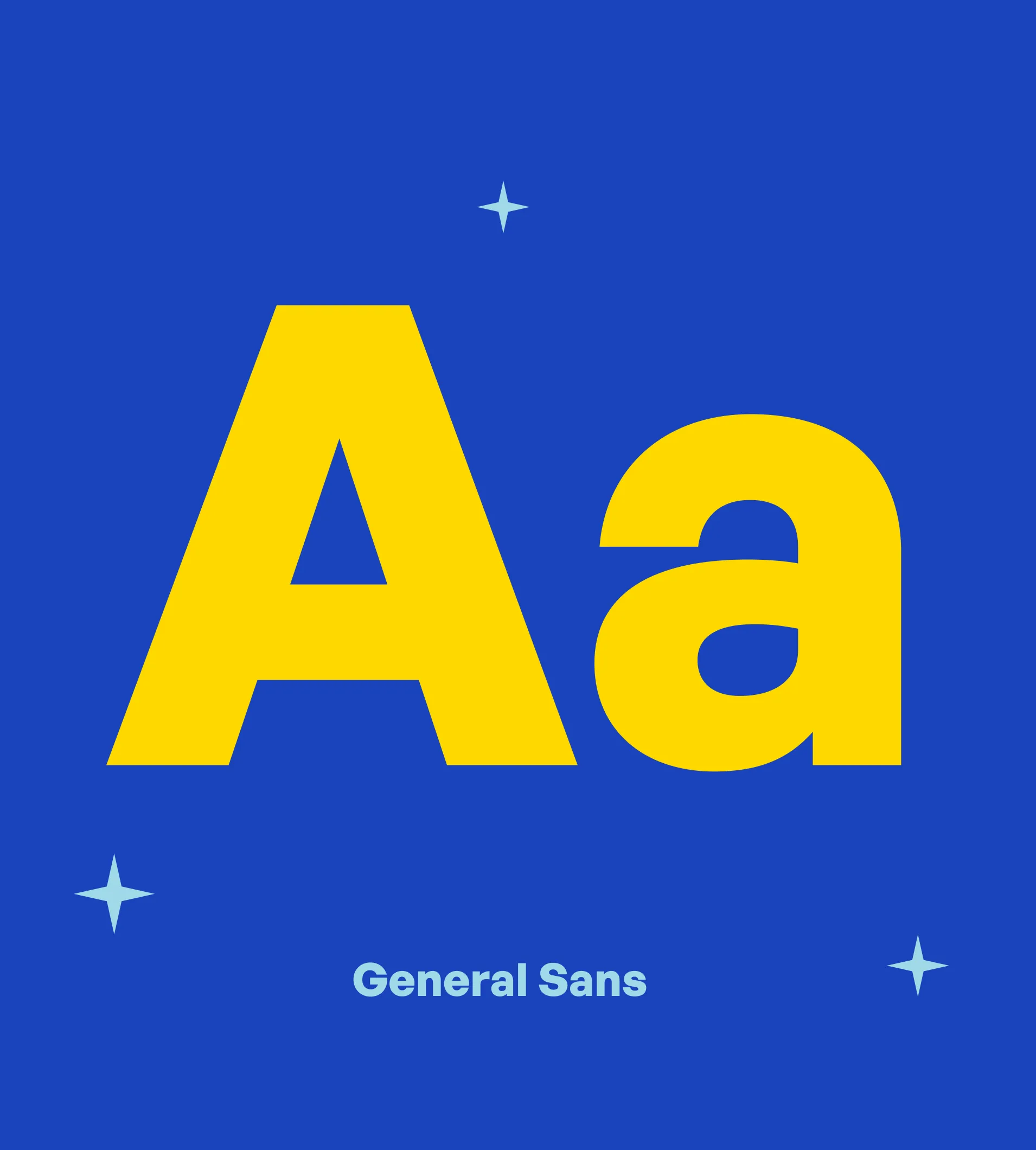
Whatabite uses General Sans as its primary font to deliver a bold, modern, and approachable voice. Its clean forms enhance readability while giving the brand a fresh, confident personality. Paired with Marverlo as the secondary typeface, it brings flexibility and balance ideal for supporting text, highlights, and brand messaging.
.webp)
.webp)
.webp)
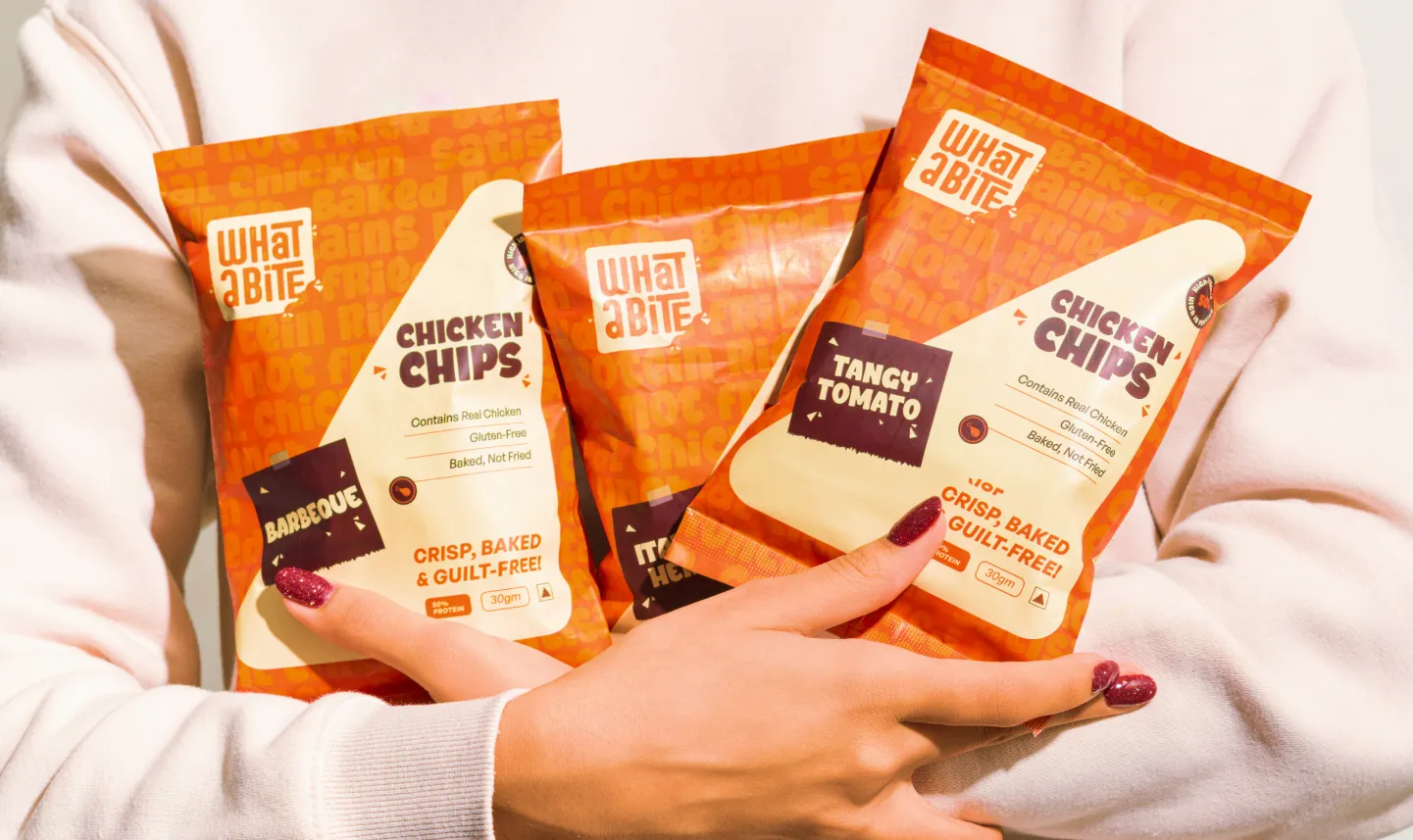
The packaging design of WhatABite Chicken Chips is bold, vibrant, and consumer-focused, instantly catching attention with its energetic orange-and-white palette and playful background text that reinforces key messages like “protein,” “baked,” and “not fried.” Clear and prominent claims “Contains Real Chicken,” “Gluten-Free,” and “Baked, Not Fried” along with the “50% protein” badge establish trust and highlight the brand’s health-first positioning. Chunky typography paired with the playful torn-paper flavor label adds character and approachability, while the clear 30g size makes it ideal for on-the-go snacking. Overall, the design balances nutrition, indulgence, and youthful energy, aligning seamlessly with WhatABite’s identity
.webp)
.webp)
.webp)


.svg)
.webp)

.svg)
.svg)
.webp)
.webp)

.webp)
.svg)