%201.webp)
02
AI Snaps
.svg)
.svg)
01
Our Work

03
About Us
05
Contact Us
06
Client Success

07
Blogs
08
Careers
Book A Call


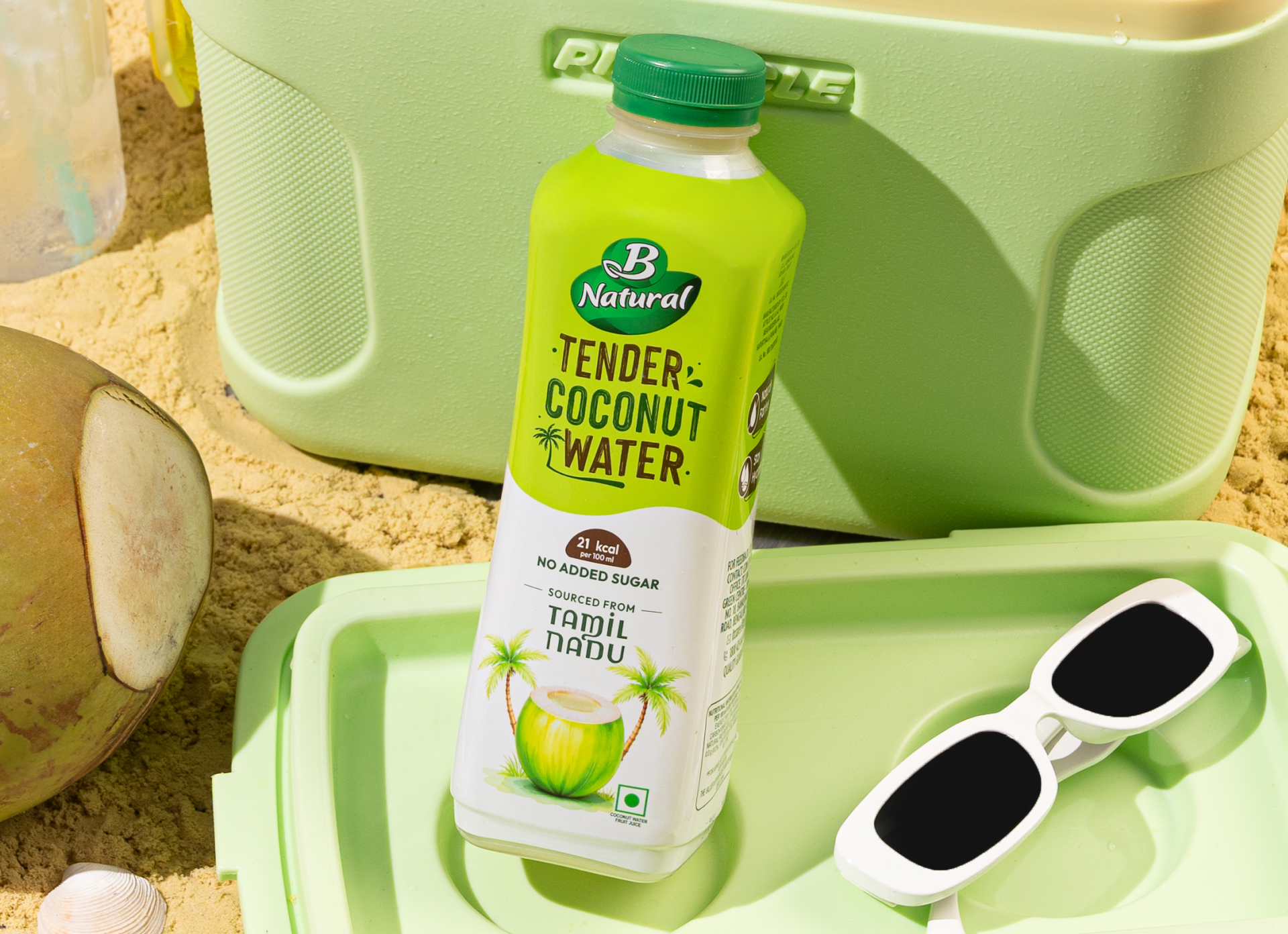
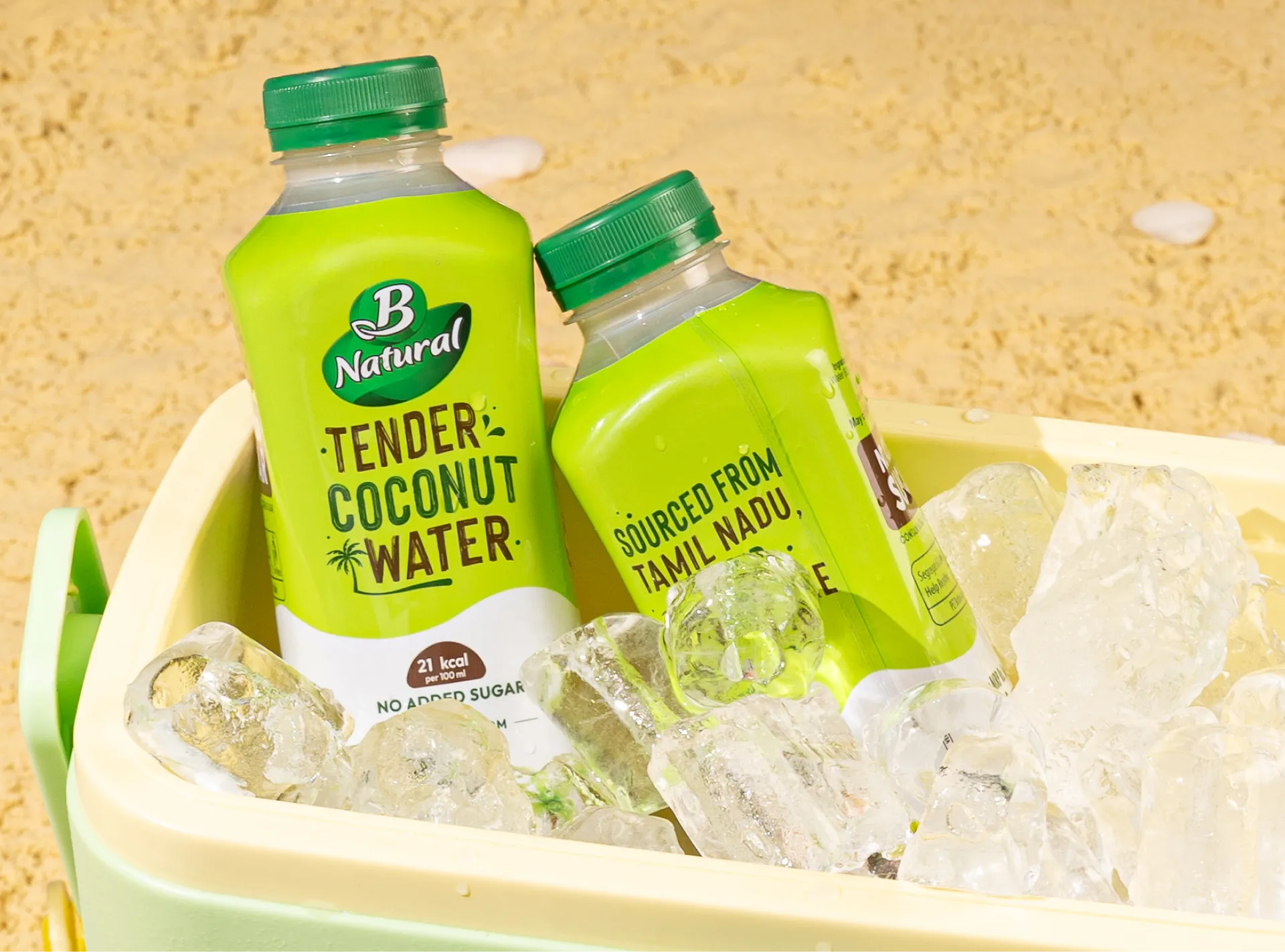
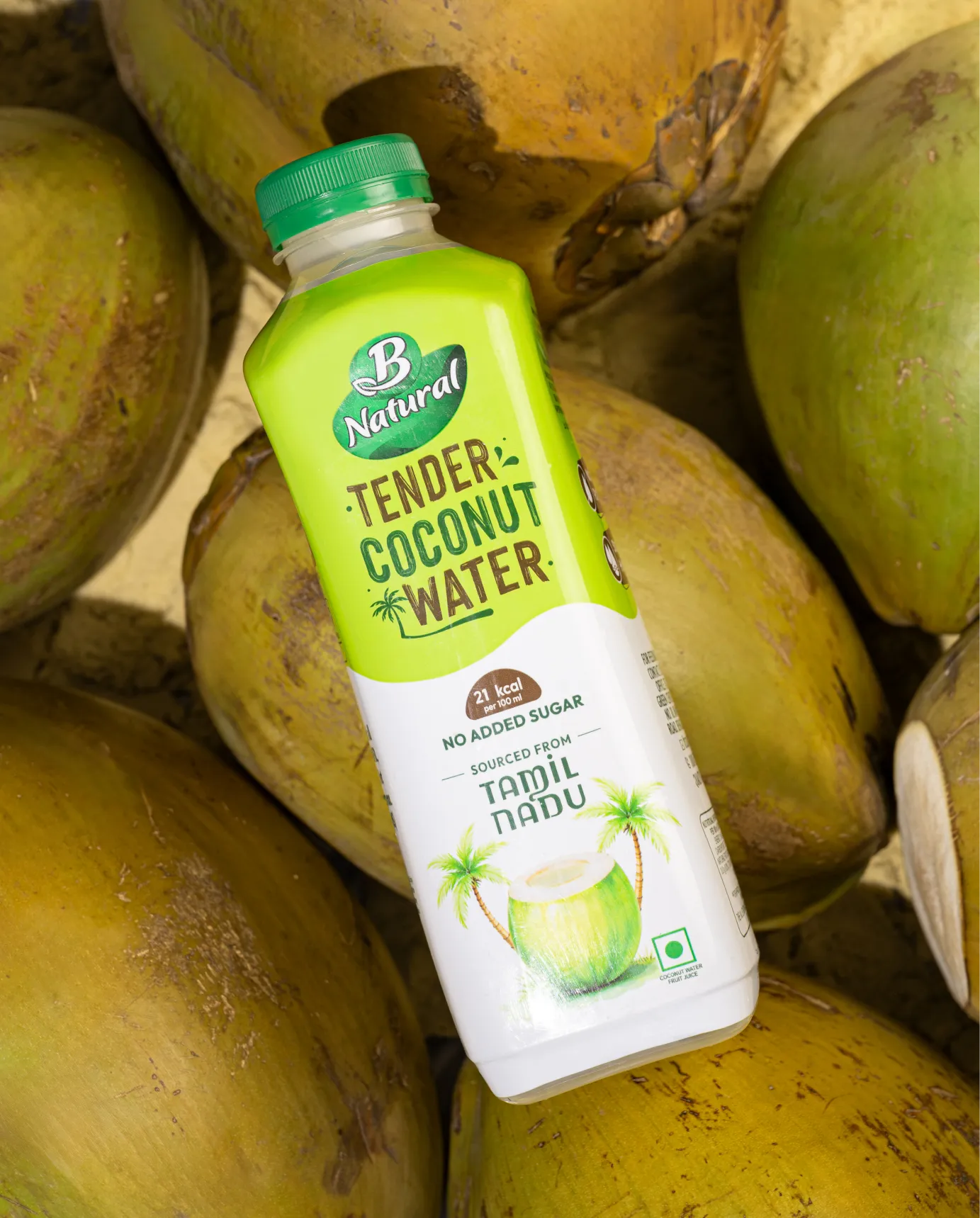
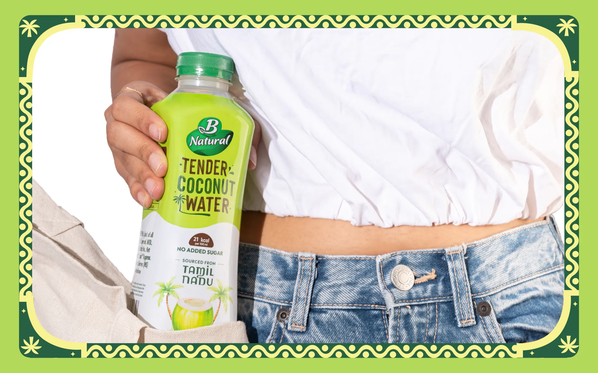
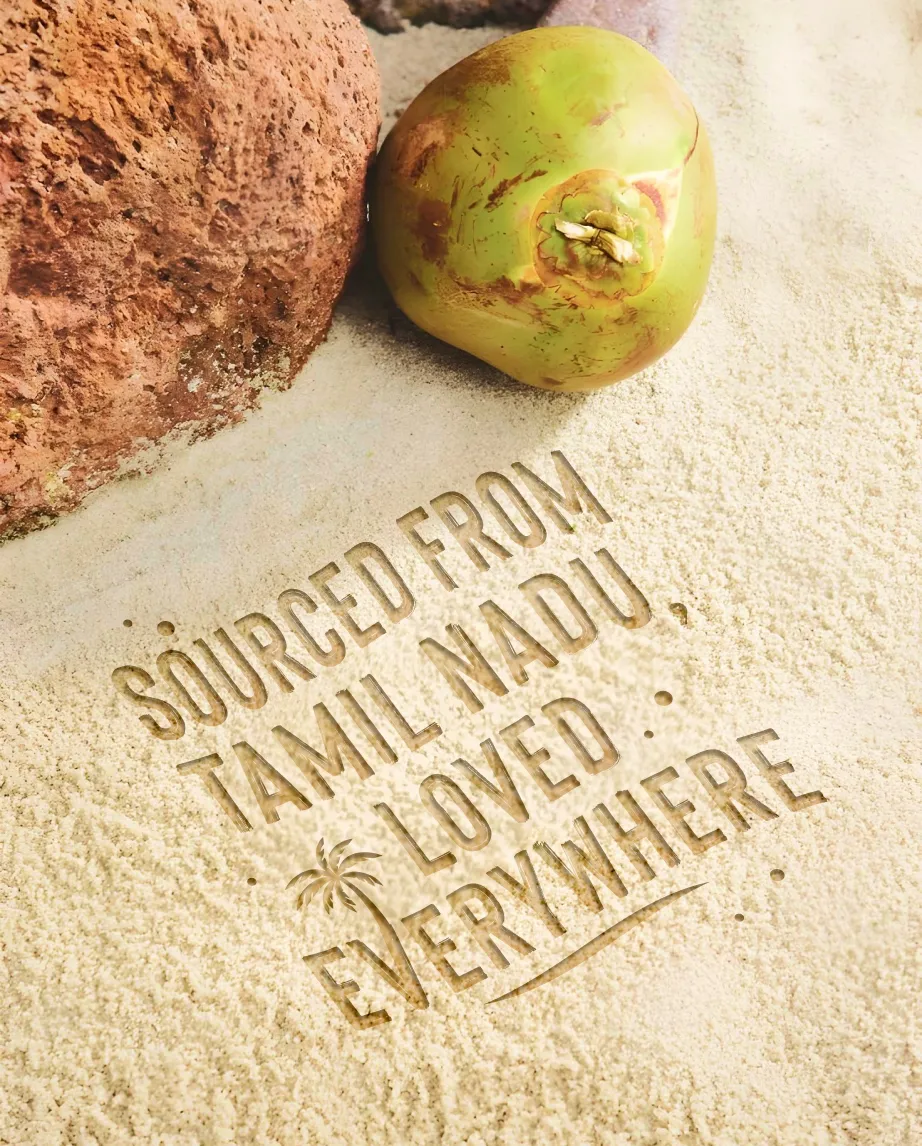
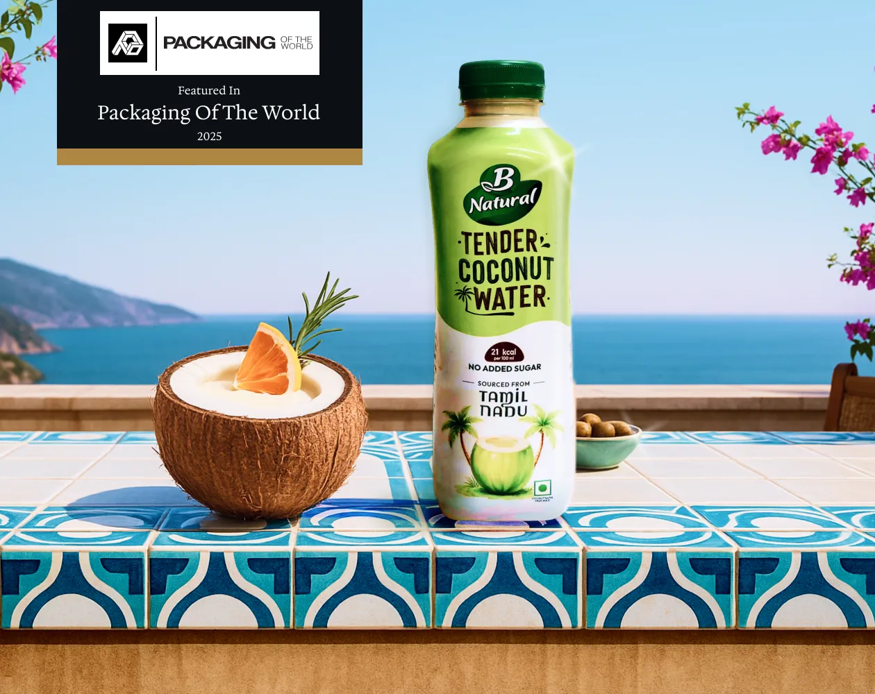
ITC Coconut Water is a packaged beverage brand built around freshness, simplicity, and natural hydration. Sourced from Tamil Nadu, the product draws from regions where coconuts are a part of everyday life. Confetti partnered with ITC to reimagine the packaging for their coconut water range, focusing on visual storytelling through illustration, typography, and colour. The objective was to move away from generic beverage aesthetics and create a pack that feels rooted in Indian coastal culture while remaining clean, modern, and easy to navigate on shelf
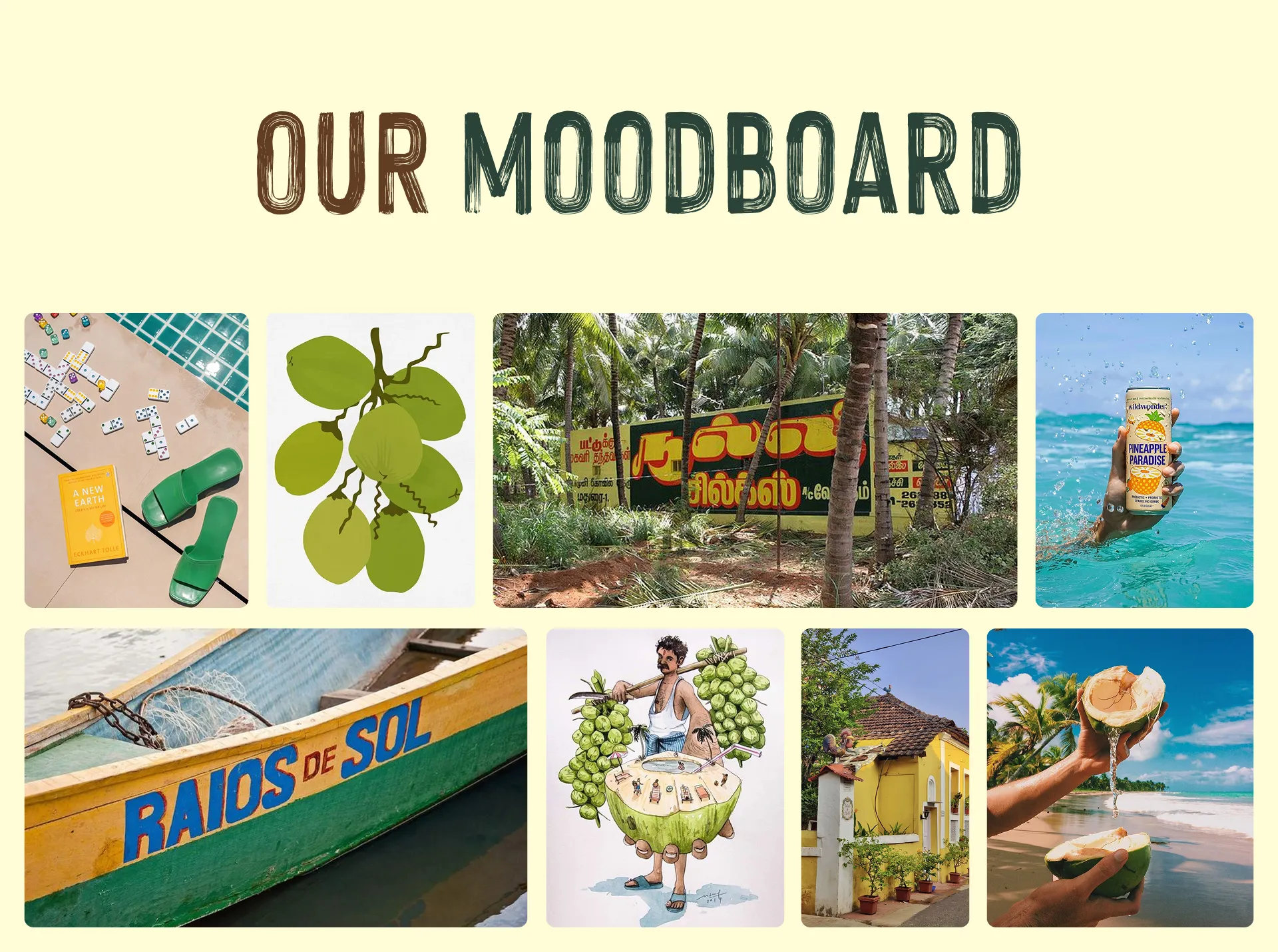
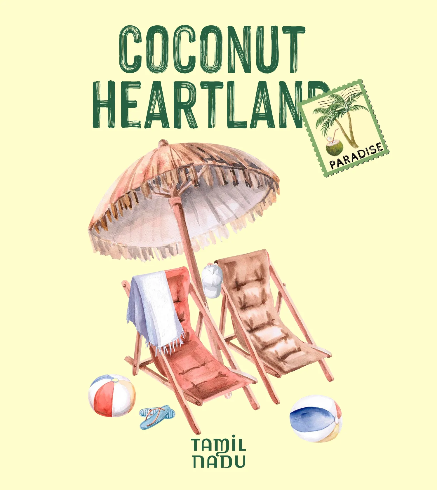
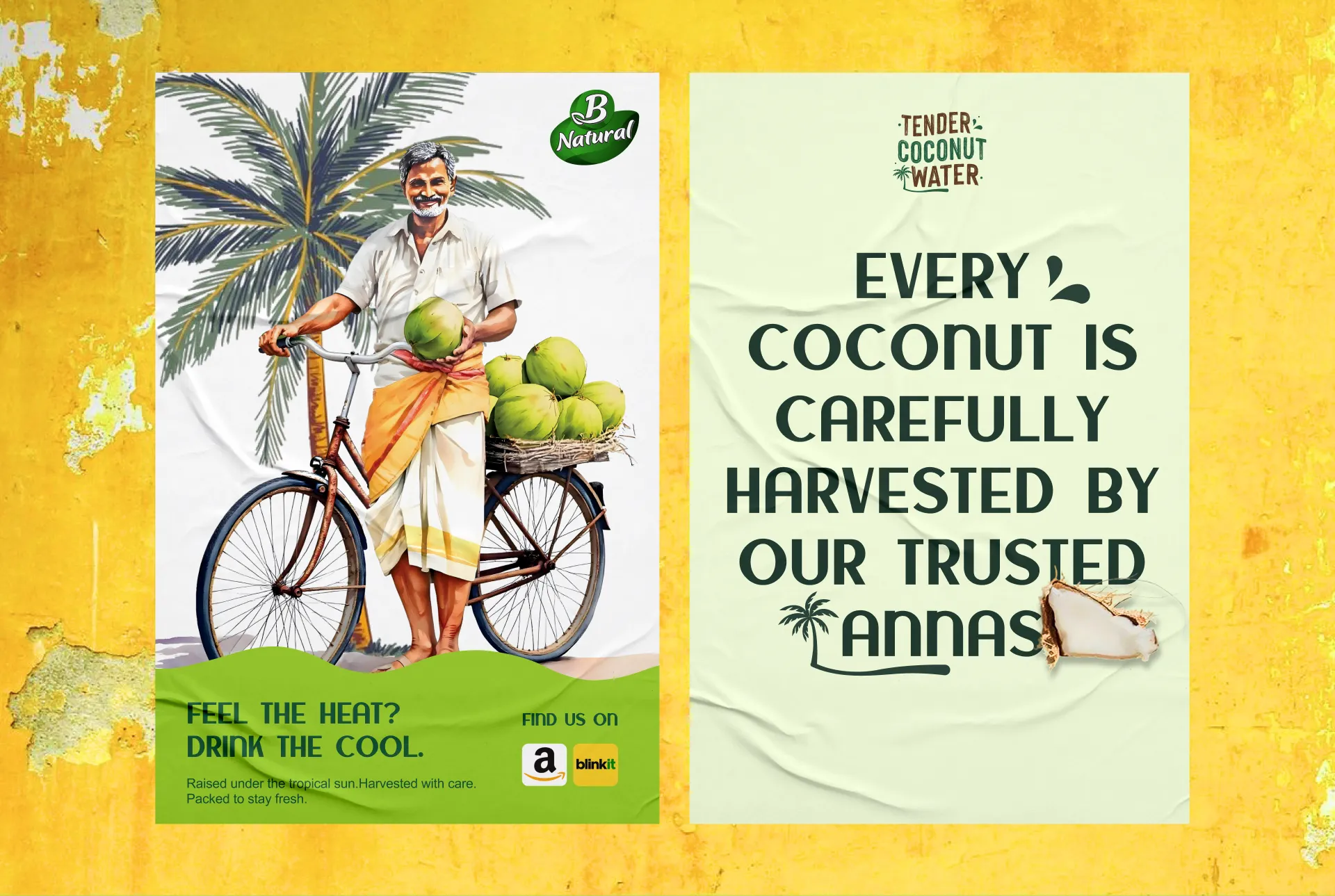
Confetti approached the packaging by observing how coconut water exists in real life across India. From handwritten boat names along the coast to roadside coconut vendors and hand-painted signboards, we drew inspiration from visual cues that feel human and lived-in. Instead of building a hyper-polished tropical fantasy, we focused on translating these everyday references into a refined illustration and typography system. The goal was to make the pack feel familiar by capturing the spirit of the coast without literalising it.
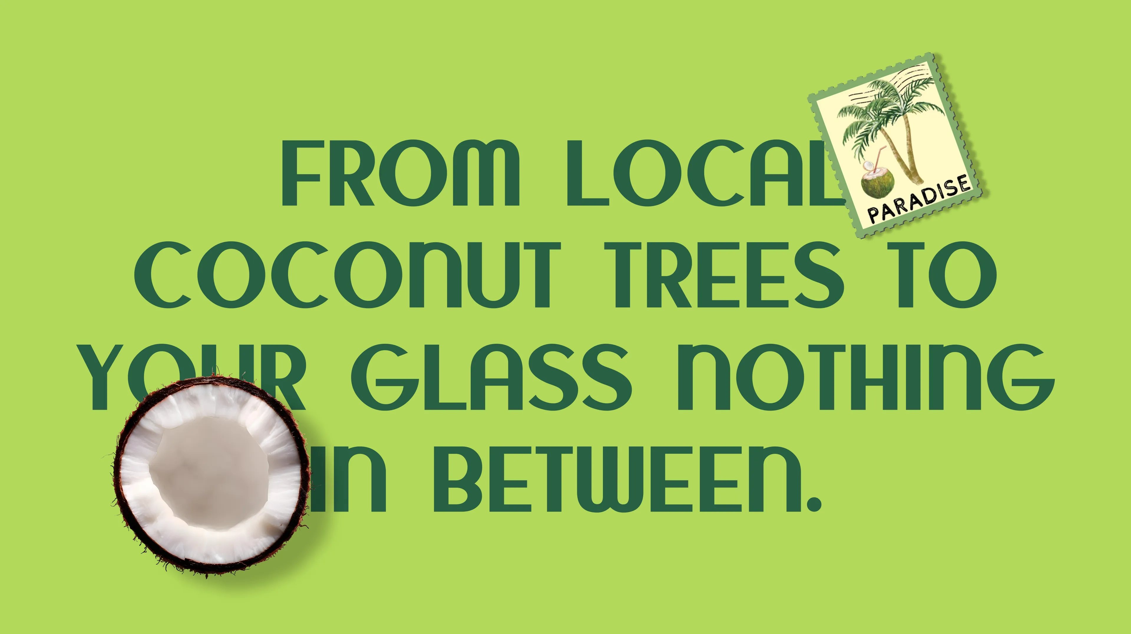
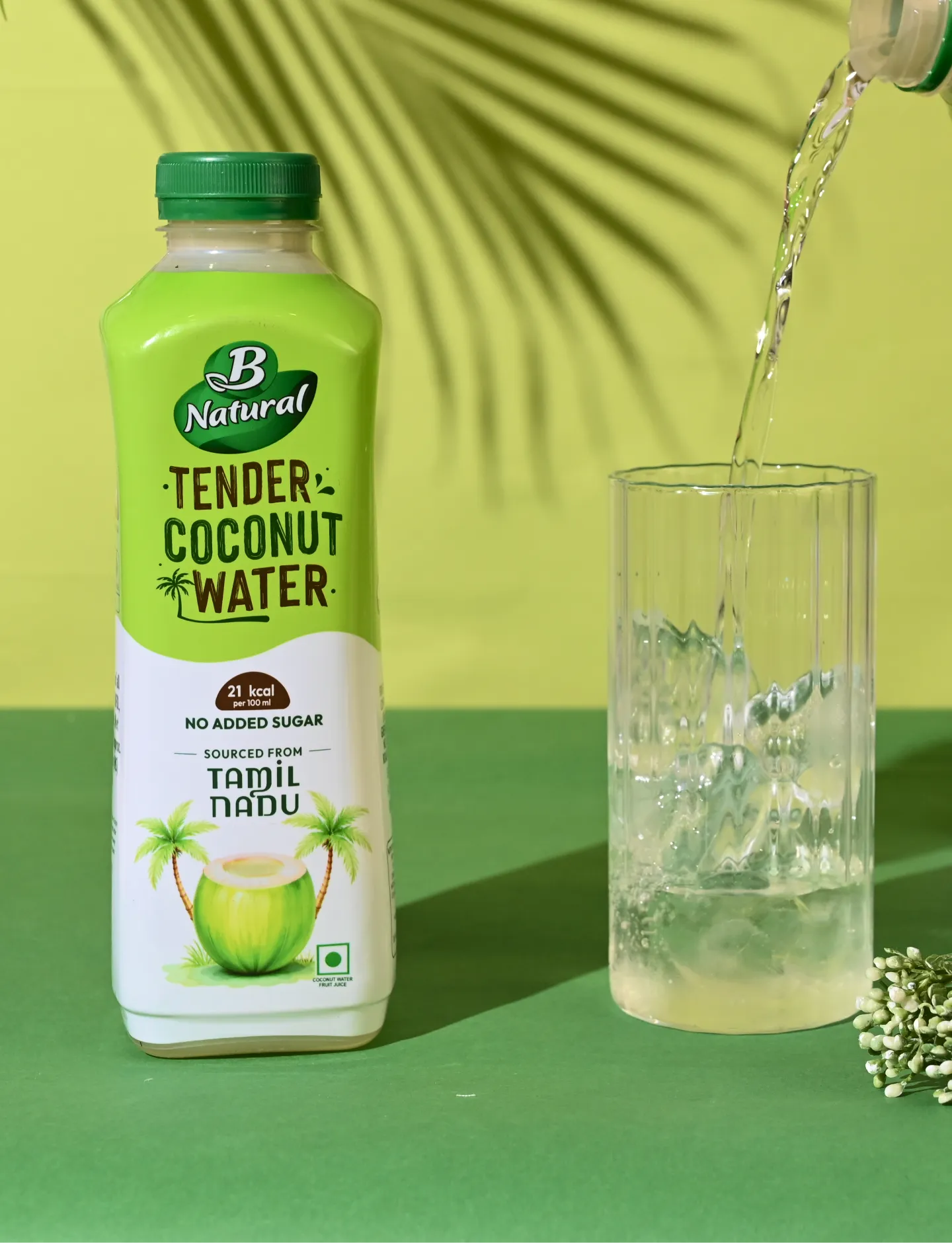
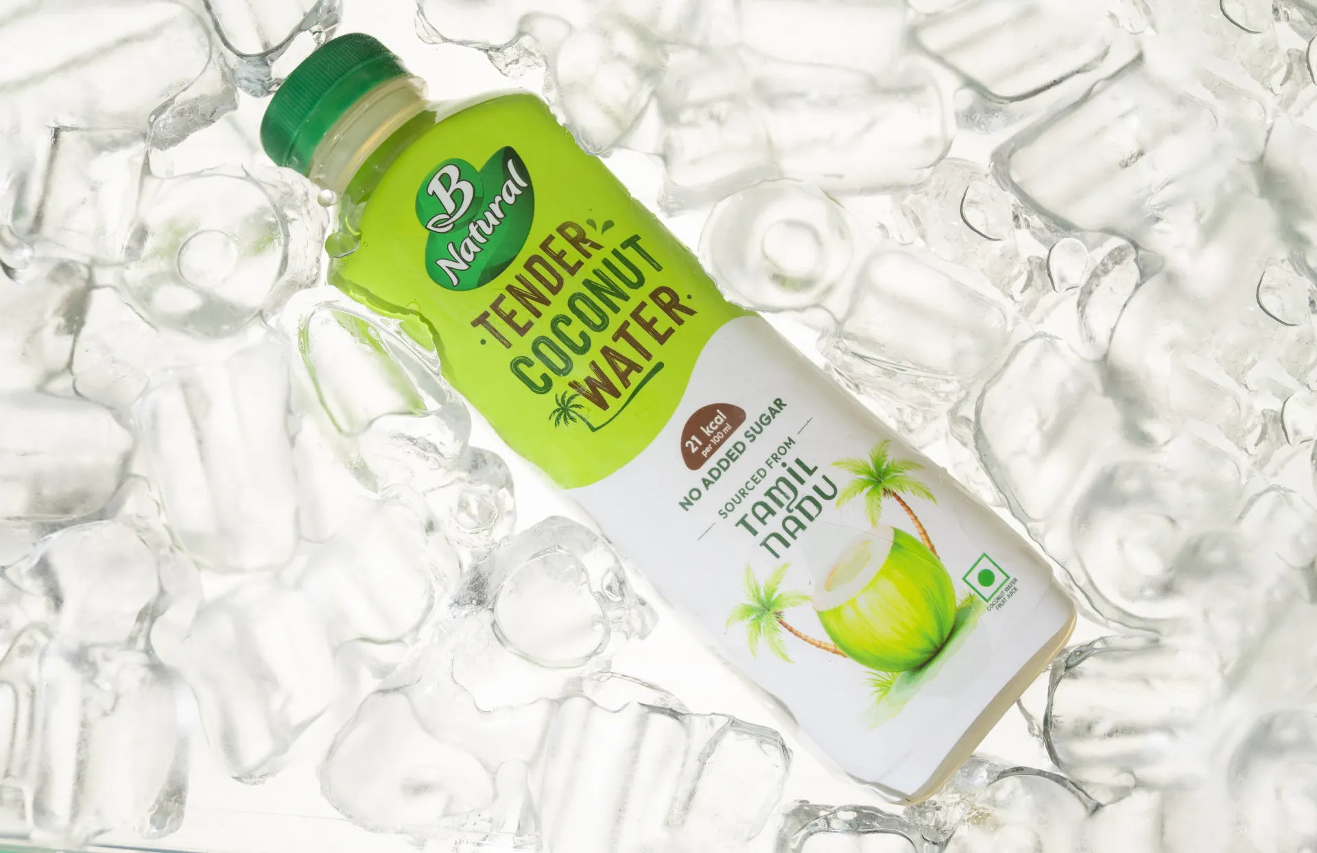
The color palette is rooted in nature. Fresh, vibrant greens form the foundation, instantly communicating wellness, hydration, and the vitality of tender coconuts. These are balanced with crisp whites, symbolising purity, cleanliness, and transparency—key cues for a natural beverage. Subtle coconut and neutral tones add warmth and authenticity, ensuring the design feels grounded rather than overly processed. Together, the palette creates a visually cooling effect, echoing the refreshing experience of the drink itself and enhancing shelf visibility across retail and quick-commerce platforms
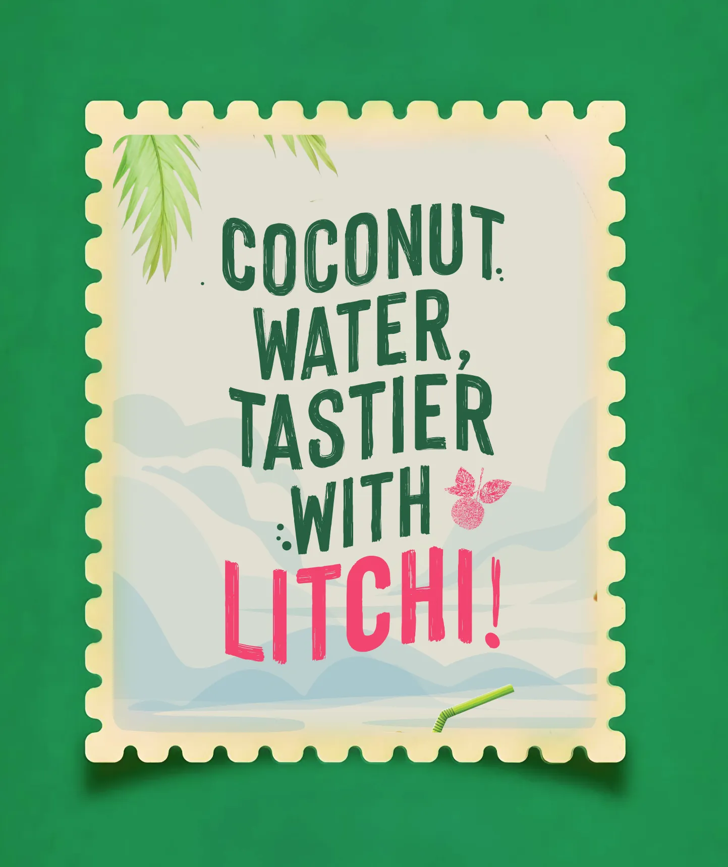
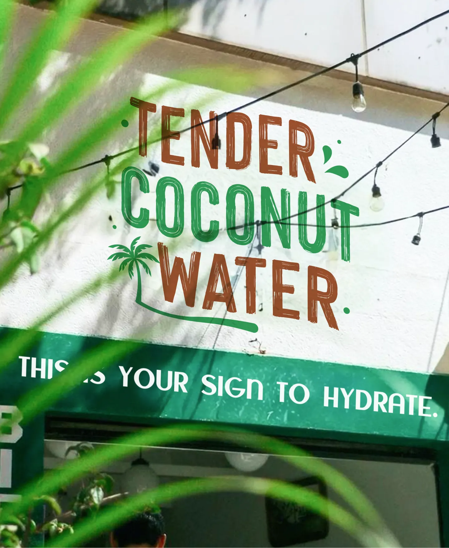
Complementing the colors, the typography is clean, modern, and highly legible. A contemporary sans-serif typeface is used to convey trust, simplicity, and clarity, allowing the product name and key benefits to stand out instantly. The typographic hierarchy is intentionally minimal, ensuring information is easy to scan while maintaining a light, breathable layout. Generous spacing reinforces the sense of freshness and aligns seamlessly with the white-led color system.
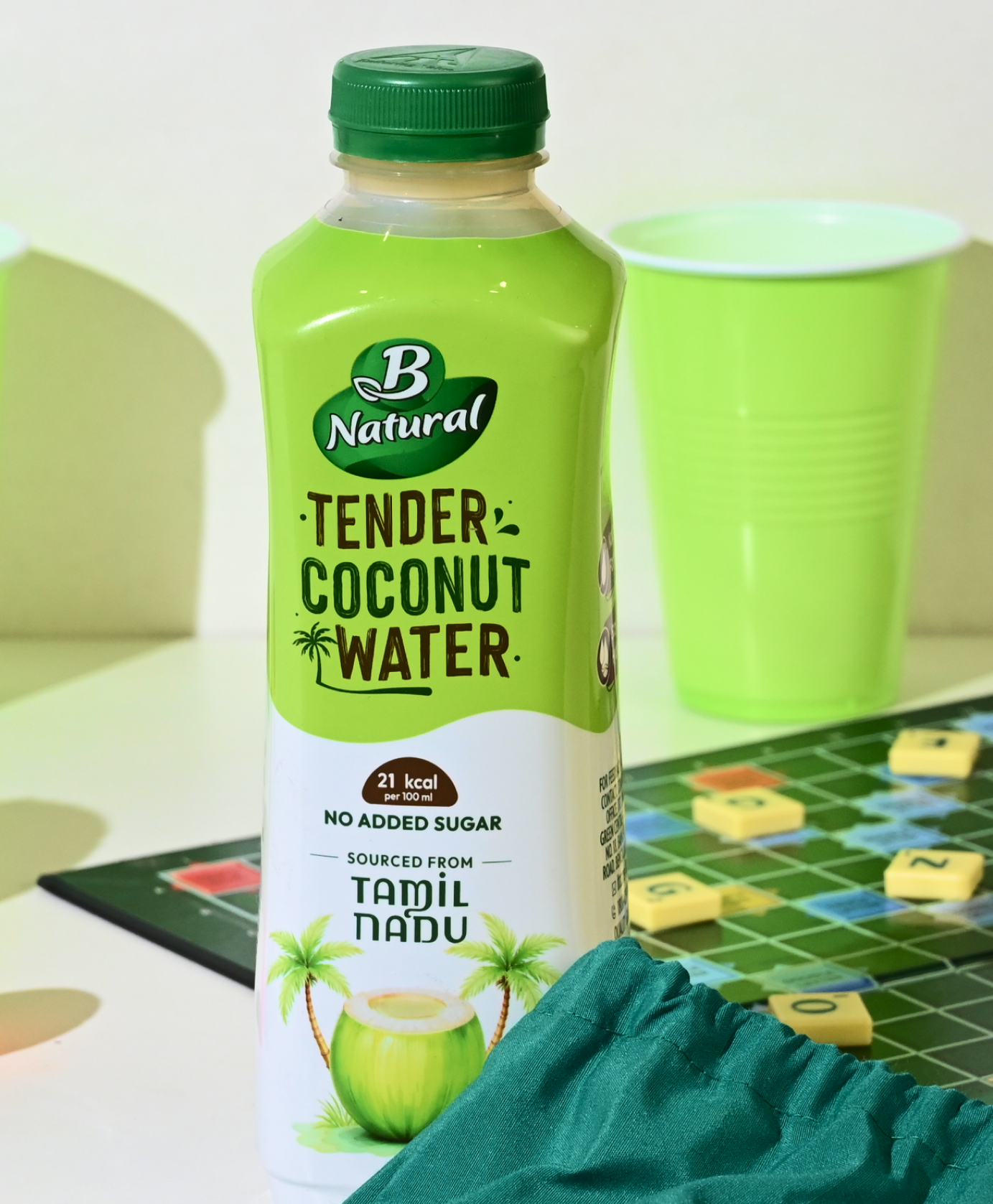
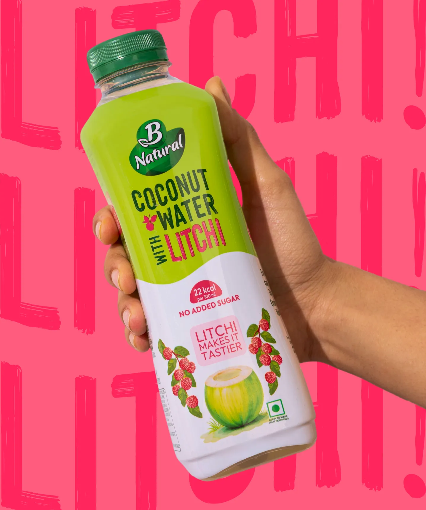
The packaging system is built around a coastal colour palette featuring palm grove green, lime leaf, pale sunshine, coconut husk brown, cloud white, and sunset pink for the lychee variant. These colours create a natural, fresh and inviting shelf presence. The typography takes inspiration from hand-painted lettering commonly seen on boats and roadside signage in coastal regions.
Illustrations include a coconut vendor with a cart, reflecting how coconut water is sold across most Indian states, alongside coconut and palm visuals that reinforce source and freshness.
A milestone-inspired graphic element displays calories per 100 ml, referencing the stone milestones seen along Indian highways. This adds a subtle cultural touch while presenting nutritional information in a distinctive and memorable way.For the lychee flavour, pink hues and lychee illustrations are introduced while retaining the same base system, allowing the range to feel cohesive yet differentiated.


.svg)
.webp)

.svg)
.svg)
.webp)
.webp)

.webp)

.svg)