%201.webp)
02
AI Snaps
.svg)
.svg)
01
Our Work

03
About Us
05
Contact Us
06
Client Success

07
Blogs
08
Careers
Book A Call


Need Help In Building Your Brand?
Click the button below & book a call with our founder directly.

Rishabh Jain
Managing Director
Colour psychology is the study of how colours influence human emotions, perceptions, and behaviour.
In packaging design, it’s a critical tool used to shape how a product is seen, felt, and judged by a customer before they get into the detail of the product.
Research consistently shows that a large percentage of first impressions are driven by colour alone. That makes it one of the most effective tools for your product in branding and packaging.
When you see a colour, your brain processes it through the limbic system, the part responsible for emotions and memory.
This happens before rational thought kicks in. So by the time a customer is consciously evaluating your product, colour has already done its job.
Different colours reliably trigger different emotional responses. Here's how the key packaging colours map to emotion and brand use:
Great packaging colour does three things: differentiate, connect, and memorise:
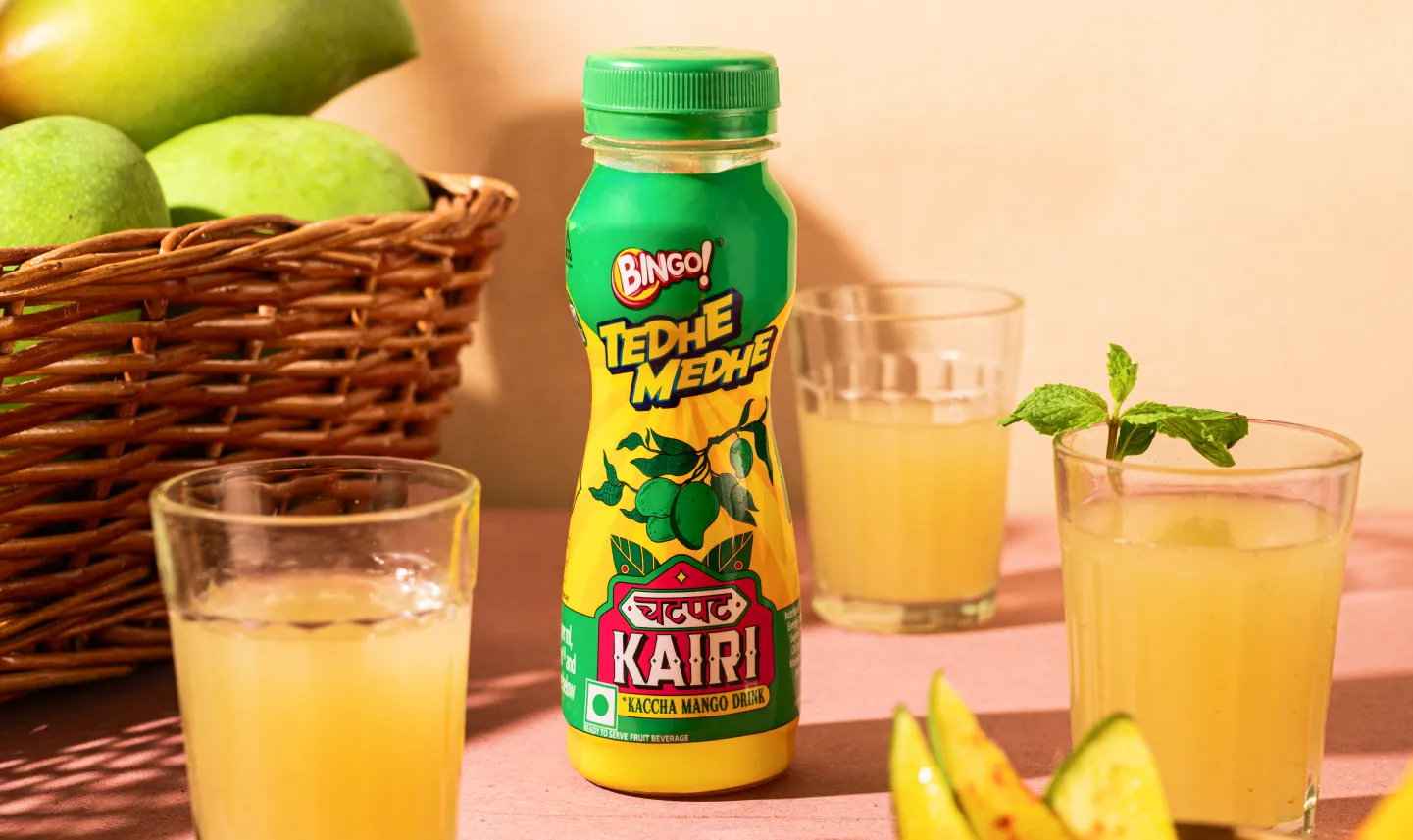
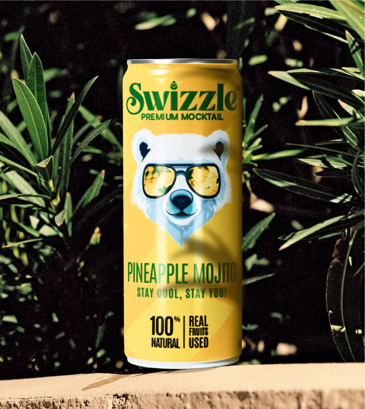
Differentiates: In crowded categories, colour helps brands stand out. For ITC B Natural, we at Confetti, shifted to a fresh, food-first palette with realistic illustrations creating a distinct, trustworthy shelf presence.
Connects: Colour builds emotional resonance, creating instant psychological associations that help customers recognize, trust, and connect with a brand.
Memorise: Consistent colour use drives recognition. Strong colour systems make brands instantly identifiable across platforms, from retail shelves to e-commerce.

The most effective packaging designs are built on colour theory.
Colour theory is the set of principles that explains how colours work together, how they’re perceived, and how they influence behaviour.
In packaging design,it acts like a toolkit that separates forgettable packaging from packaging that sells.
📝(Learner’s Note: For those interested in a deeper technical understanding, the Pantone Colour Systems guide is one of the most authoritative resources in the industry.)
The colour wheel is the foundation of all colour decisions. It organises colours based on their relationships:
The relationships between these colours shape how packaging feels to the eye.
Some combinations create energy and tension. Others create harmony and calm. And that emotional response is happening in the customer's brain before they come across your product.
These are the core colour relationships that packaging designers work with:
Example: A beverage brand using orange and blue (complementary) will feel bold and energetic. A skincare brand using soft greens and neutrals (analogous) will feel calm and natural.
Beyond these schemes, four variables define how colour performs on packaging:
1. Value (Light vs Dark): Used correctly, value creates visual hierarchy and directs attention.
Light colours → soft, clean, accessible
Dark colours → premium, bold, high contrast
2. Saturation (Intensity): This directly impacts perceived product positioning.
High saturation → energetic, youthful, attention-grabbing
Low saturation → refined, muted, sophisticated
3. Temperature (Warm vs Cool): Warm colours tend to “advance” visually. Cool colours tend to “recede.”
Warm colours (red, orange, yellow) → energetic, appetising, attention-forward
Cool colours (blue, green, purple) → calm, trustworthy, controlled
4. Contrast: It determines how quickly packaging is seen and understood.
High Contrast (Bold and highly visible) → Easier to read at a distance, works best in crowded retail environments
Low Contrast (Subtle and refined) → Feels premium and understated, works for niche or luxury positioning
One of the most effective ways to structure colour in packaging is the 60-30-10 rule.
It works like this:
Example: A skincare brand positioning itself as clean and natural uses 60%a soft white or warm cream. 30% is given to muted sage green. And the remaining 10% might be a terracotta accent.
The balance gives the packaging visual structure without overwhelming the customer. And it makes the brand instantly recognisable, even at a glance.
Colour doesn’t behave the same across all packaging formats. The same shade can look completely different on:
This is where many brands lose consistency. Colour theory must be applied alongside print and material knowledge to ensure accuracy.
Colour psychology in packaging varies within category conventions.
These are the unwritten visual rules that consumers have been trained to expect through years of shopping.
Break those rules deliberately and you can stand out brilliantly. Break them by accident and you'll confuse people right off the shelf.
Here’s a quick look at what works and does not across industries:
This is the most emotionally charged category. Colour here sets expectations around taste, freshness, and safety.
In addition to the colour, its shade matters too. Deep, saturated colours suggest intensity; lighter tones feel mild or delicate.
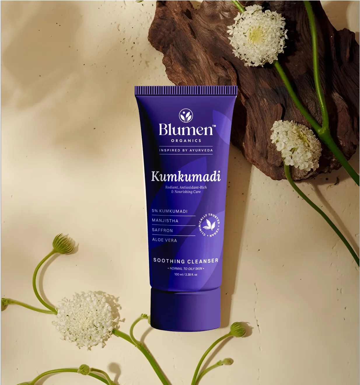
The health and beauty category is one of the most colour-sophisticated in retail.
Here, colour has to do two jobs at once: build trust and reflect the user’s identity. Consumers are often making personal, even vulnerable decisions.
Overly bright or loud colours can undermine trust, especially in skincare.
Tech buyers are looking for reliability, performance, and control. Colour here reduces perceived risk.
Warm colours (red, orange, yellow) are avoided in premium tech as they may feel impulsive and noisy, which clashes with the calm confidence tech aims to project.
This category is evolving fast, and consumers are becoming more critical. Colour is often the first signal of environmental intent, but it must feel credible.
Consumers are increasingly aware of greenwashing. If colour suggests sustainability but materials don’t support it, trust erodes quickly.

Most brands jump into picking colours before defining what those colours need to do.
The result? Packaging that looks fine alone but underperforms on shelf, online, or in production.
Choosing the right palette for your brand needs to follow a clear process as given below:
Before opening a colour picker, get clear on what your brand needs to communicate.
A useful way to approach this is through brand archetypes.
The Hero feels bold and driven. The Caregiver feels warm and nurturing. The Explorer feels adventurous and free. The Sage feels authoritative and trusted.
Each archetype points to a different emotional palette.
Ask yourself:
❓If your brand were a person, how would they enter a room?
❓What should a customer feel when they first hold your product?
❓What three words should your packaging communicate instantly?
This becomes your colour brief. Without this clarity, colour choices become subjective and inconsistent.
Your brand personality is internal. Your customer’s perception is external.
Both of these must align.
Consider gender, age, and cultural background. All these influence colour response.
Key points:
Age: Younger audiences respond to bold, experimental palettes. Older audiences prefer stability and restraint
Category familiarity: Customers trust colours they already associate with product types
Perception of value
Yellow is the colour most associated with "cheapness" and “affordability”. Use it with care outside food/snack contexts.
This step is one of the most valuable and most overlooked parts of building a packaging colour palette.
Before you finalise anything, do a colour audit of your competitive set.
Walk the aisle. Scan the shelf. Screenshot the top products online and compare them side by side.
Notice the patterns: which colours dominate, what’s completely absent, where everything feels crowded, and where there’s breathing room.
This gives you a deliberate choice:
Option A: Align with Category
Use familiar colours to build trust and recognition especially in categories like healthcare, baby products, or finance where reassurance matters most.
Option B: Disrupt the Category
Choose colours your competitors avoid to stand out instantly. Ideal for challenger brands in crowded markets.
There’s no correct option. but either is better than picking colours in a vacuum. Here’s a quick look at the options:
The colour you see on screen is not the colour that shows up on your packaging.
They render differently across materials and print processes.
Colours shift. A deep forest green on gloss can turn flat on kraft. A vibrant coral on screen can skew orange in CMYK on recycled stock.
Before you commit, understand:
Always get printed proofs on your actual substrate before approval. What you sign off is what gets produced, see it in your hands first.
Your palette might look perfect in isolation. The real test is how it performs in the wild.
On shelf: Does it stand out or disappear among competitors? Simulate it, print a mockup, place it next to others, take a photo, squint. If you can’t spot it instantly, it’s not working hard enough.
On screen: E-commerce shrinks everything. Your product may appear as a tiny thumbnail on white. Does the colour still read clearly? Does it hold up under studio lighting?
In motion: Packaging now lives in video and social. Does your palette translate well to short-form content? Does it hold up in unboxing?
For diverse audiences: Check accessibility. Use tools like the WebAIM Contrast Checker to ensure key information: name, claims, instructions—is legible for people with colour vision deficiencies.
Most brands choose colours based on gut feel, not strategy, and it shows on the shelf.
At Confetti, we treat packaging colour strategy as a brand communication decision that is expressed through colour.
Our approach to packaging colour starts with brand discovery: understanding not just what a brand looks like, but what it needs to feel like to the end consumer.
Once the discovery phase sets the strategic foundation, our colour process moves through four clear stages:
Stage 1: Brand Personality Mapping
Translate brand values and audience insights into a colour direction: warm or cool, bold or restrained, saturated or muted.
This is about territory, not shades, grounded in discovery, not aesthetic preference.
Stage 2: Competitive Colour Audit
Map the dominant colours across competitors, locally and internationally, to identify category saturation, whitespace, and whether the brand should signal membership or disrupt.
Stage 3: Palette Development and Testing
Build primary, secondary, and accent colours using the 60-30-10 framework.
Test how colours behave across different substrates and finishes: gloss, uncoated, kraft board, to ensure the palette performs in the real world.
Stage 4: In-Context Shelf and Digital Simulation
Simulate packaging in real-life contexts, on-shelf alongside competitors and in e-commerce imagery: to spot visibility, contrast, or comprehension issues that isolated studio mockups can’t reveal.
We have applied this process across our branding and packaging projects in food and beverage, health and beauty, lifestyle, and premium gifting categories.
The specifics vary by brand and market, but the underlying principle remains: colour = communication. And it deserves the same rigour and strategic thinking as any other element of a brand's identity.
Right now, packaging colour is being pulled in two clear directions:
The brands winning are choosing one direction clearly, based on their audience and positioning.
Earthy palettes are no longer niche. They are mainstream.
Terracotta, Olive green, Clay browns, Muted ochre and Unbleached beige are everywhere,
This shift reflects a deeper consumer expectation: “Show me you’re genuinely sustainable, not just visually.”
Consumer awareness has shifted and kraft brown alone no longer signals credibility.
What works now:
If the material doesn’t support the story, the colour feels performative.
At the opposite end, challenger brands are going loud.
It features a single dominant bold color, high-saturation palettes, minimal distractions, and strong typography.
This approach makes products instantly visible on the shelf, and is well-suited for social media and e-commerce, and creates fast recognition in crowded categories.
Best suited for:
However, if not anchored in a strong brand identity, it can age quickly.
This is the quiet, confident alternative.
It is defined by the use of one color in multiple tones, subtle contrast through finishes, and minimal visual noise.
This style signals precision, quality, and confidence. It's common in luxury skincare, premium spirits and high-end gifting
It requires the execution to be flawless. Without high-quality materials and finishes, it won’t work.
Nostalgia is commercially powerful.
Popular palette cues include mustard yellow, dusty pink, avocado green, retro teal, and faded orange.
This trend feels familiar and human, builds emotional trust quickly, and stands out in a hyper-modern landscape.
Gradients continue to grow, especially in digital-first categories
They add movement, depth, and visual energy.
They perform well because they look strong in thumbnails and ads, interact dynamically with light, and feel modern and “designed for screen.
This approach is commonly being used in beauty, wellness, tech accessories, and premium beverages.
Dark navy for a food brand. Hot pink for a supplement. Forest green for a tech product.
Many brands are deliberately breaking category colour conventions to create memorability.
Over two hundred projects at Confetti have taught us that colour missteps can erode shelf impact, confuse consumers, and waste marketing investment.
Here are the most common pitfalls and how to steer clear of them:
❌Choosing colours based on personal preference, not customer insight.
Your favourite shade may not resonate with your target audience. Colour decisions should be driven by research, not ego.
We’ve seen legacy brands attempt a “refresh” that alienated loyal buyers simply because the new palette reflected internal taste rather than consumer expectations.
❌Ignoring how colour changes across substrates and finishes.
A colour looks different on glossy carton board, matte film, recycled kraft, or metallic foil. Failing to test materials leads to muddy, inconsistent results.
At Confetti, we always proof colours on the actual packaging substrate to ensure the final output matches the vision.
❌Following trends blindly without brand fit.
Jumping on a trending palette like millennial pink or neon accents without strategic alignment can date your packaging overnight.
Trends should be interpreted, not copied. Our work on Cookwell NutriPro modernised a legacy brand with a refined palette that felt current but never trend-dependent.
❌Forgetting how packaging looks on a screen versus a shelf.
With e‑commerce and quick commerce dominating, your palette must work as a thumbnail on a smartphone.
Low contrast or overly subtle hues disappear at small sizes.
❌Overlooking cultural colour meanings when selling internationally.
A colour that signals purity in one culture may signify mourning in another.
Brands expanding across regions must adapt or at least verify that their palette doesn’t carry unintended connotations.
❌Failing to plan for colour consistency across print runs.
Without proper brand colour specifications and print management, a palette can drift between batches, eroding brand equity. We provide detailed colour standards to every partner.
What colours work best for packaging design?
The choice of colors depends on your product type, target customer, and brand personality. Red, green, and blue are the most consistently high-performing across categories, but the best choice is always the one that reflects your brand and resonates with your specific audience.
How do packaging colours influence consumer buying decisions?
Studies show that up to 90% of snap product judgments are colour-based. Colour triggers emotional responses in the brain before rational analysis kicks in, making it the single most powerful visual tool on your packaging.
What is colour theory in packaging design?
Colour theory in packaging design is the practice of using the colour wheel, colour relationships (complementary, analogous, triadic), and psychological colour associations to create packaging that communicates the right message, attracts the right customer, and stands out on shelf.
What is the 3:1 colour rule in packaging?
The 3:1 ratio means using one primary dominant colour and allowing secondary/accent colours to complement rather than compete with it. It creates visual hierarchy and brand clarity on packaging.
Should packaging colours change for international markets?
Yes. Colour meanings vary across cultures to a large extent. White signals purity in the West but mourning in parts of Asia. Green is associated with nature globally but has specific religious and political connotations in some regions. Always research cultural colour perception before entering new markets.
Want strategic branding and packaging like this for your business?


.webp)
.webp)


.webp)
.webp)
.webp)
.webp)
.webp)


.svg)
.webp)
.svg)
.webp)