%201.webp)
02
AI Snaps
.svg)
.svg)
01
Our Work

03
About Us
05
Contact Us
06
Client Success

07
Blogs
08
Careers
Book A Call


Need Help In Building Your Brand?
Click the button below & book a call with our founder directly.

Rishabh Jain
Managing Director
Nutraceutical packaging designs are not only essential for compliance but it is also the foundation that helps build trust and differentiate brands in an increasingly competitive wellness market.
Explore with branding and packaging design experts at Confetti, branding principles importance and other essential aspects behind supplement packaging design,
In the supplement and nutraceutical industry, packaging design is the first and most powerful trust signal a consumer encounters.
Thus, investing in strategic nutraceutical packaging design directly influences brand credibility, purchase decisions, and long-term loyalty.
Consumers judge nutraceuticals in seconds.
Packaging cues like layout, typography, color, and materials, etc. shape trust and perceived quality.
Premium finishes and clean, structured design signal purity and scientific rigor, while cluttered graphics or cheap materials raise doubts.
When packaging looks precise and high-end, consumers expect the product to work
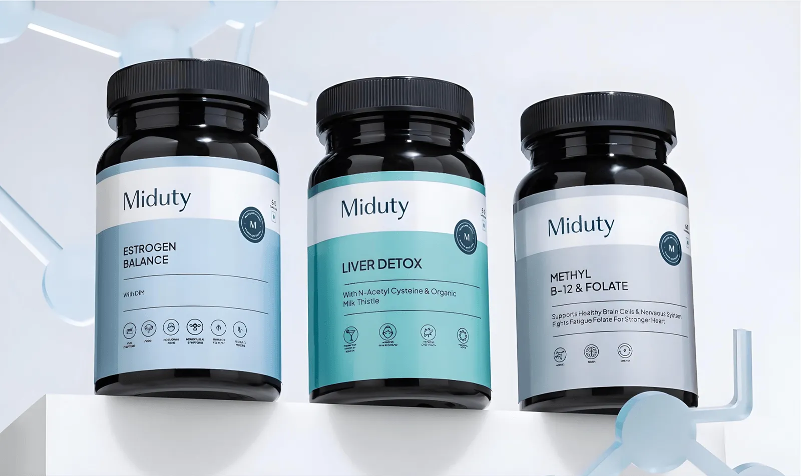
Example: For Miduty, we at Confetti used minimal, well-organized packaging design to communicate quality and clinical confidence without overwhelming the buyer.
The nutraceutical sector faces a well-known trust gap caused by:
Packaging design bridges the gap.
Clear labeling, readable type, and calm hierarchy replace hype with clarity, building credibility faster than any ad.
Professional design signals a brand’s credibility and commitment to quality.
Key markers include consistent branding, strong visual hierarchy, premium materials, and clear regulatory information.
A consistent packaging system signals stability and long-term commitment, which is especially crucial for new nutraceutical brands, competing with established players.
Nutraceutical packaging as a visual document of accountability
Safety Signals: Reassure consumers of product protection and regulatory compliance.
Efficacy Signals: Borrow trust from independent authorities to support efficacy claims.
Design elements that imply scientific validation:
Legitimacy Signals: Position packaging as proof of accountability, not just marketing.
Consistent nutraceutical packaging design helps customers recognize the product instantly.
Familiar visuals create comfort, Comfort leads to loyalty.
When people trust the brand, they stop comparing alternatives and stick with what feels safe.
Modern consumers expect a balance.
They want clinical authority without feeling intimidated.
They want wellness branding without feeling misled.
Strong nutraceutical packaging design balances both and tells consumers - This product is scientifically sound, and made for real people.
For nutraceutical brands, packaging must begin with regulation and end with aesthetics, not the reverse.
Here’s an overview of the regulations that directly shape nutraceutical packaging design:
FDA Supplement Facts Panel
U.S. dietary supplements must include a Supplement Facts panel with a fixed structure.
It must list serving size, servings per container, active ingredients, amounts per serving, and % Daily Value where applicable.
The panel must follow strict rules for boxed format, heading order, font size, spacing, and hierarchy. Designers cannot modify or reinterpret this panel—creativity must happen around it.
Mandatory Label Elements
Several required elements dictate the layout grid:
Effective design ensures these elements are clear without overwhelming brand aesthetics.
Health Claims Compliance
Only structure/function claims (e.g., “supports immune health”) are allowed.
Disease claims (e.g., “treats arthritis”) are prohibited.
Typography, icons, imagery, and emphasis can unintentionally turn a legal claim into an illegal one, making visual restraint essential.
Required FDA Disclaimer
When structure/function claims appear, the FDA disclaimer must be visible, readable, and placed near the claim.
It cannot be hidden or minimized through low contrast or footnotes.
GMP and Production Markings
If used, GMP claims must be accurate and verifiable.
Lot numbers, expiration dates, tamper-evident features, and child-resistant warnings must be properly integrated into the design.
Global and State-Level Regulations
International markets (India, EU, Canada, Australia) impose different claim rules and label formats.
Most brands need modular or region-specific label systems.
“When someone chooses a wellness product, they're choosing themselves. Our packaging design philosophy recognizes this profound personal commitment.
We go beyond visual appeal to create experiences that validate their health-conscious choices and reinforce that their wellness journey matters—because it does.”
— Rishabh Jain, Founder, Confetti Design Studio
Nutraceutical packaging design begins with selecting the right format.
This directly impacts product stability, regulatory compliance, cost efficiency, consumer convenience, and brand perception.
Here’s a look at the most common nutraceutical packaging formats and how brands use them:
Bottles & Jars:
Bottles communicate pharmaceutical-style reliability and trust.
They dominate the nutraceutical market due to scalability, filling efficiency, and consumer familiarity.
They are generally used for tablets, capsules, softgels, powders, and liquids, and offer excellent moisture and oxygen barriers.
Blister Packs and Strip Packs
With each dose individually sealed, blister packs offer built-in tamper evidence and precise dosing.
They are ideal for moisture protection or oxygen-sensitive ingredients and for elderly or clinical audiences where dosage accuracy is critical.
However, they have a higher cost per unit than bottles.
Pouches and Sachets
Popular for protein powders, greens blends, and functional gummies. Sachets are often used for trial packs and promotional sampling.
Flexible packaging reduces headspace, extending shelf life for powders. It offers a large print area for branding and storytelling. Resealable zippers increase convenience.
Stick Packs
These are becoming increasingly popular for on-the-go consumers.
The stick packs deliver maximum portability and convenience with a low packaging-to-product ratio.
Tubes
Tubes create strong shelf differentiation and support travel-friendly positioning for supplement brands.
They offer excellent moisture protection when combined with desiccant caps. Squeeze tubes offer clean, controlled dispensing.
Boxes and Cartons (Secondary Packaging)
Cartons provide additional space for regulatory information, storytelling, and imagery. They protect the primary package during shipping and improve shelf presence.
They are critical in retail environments and increasingly designed for “ship-in-own-container” (SIOC) durability in e-commerce.
Selecting the right packaging format and design requires matching products with the target market, product characteristics and other factors.
Here’s a quick framework that can help you choose the right format for your supplement brand:
Consumers buy supplements to solve problems and to become a better version of themselves.
The packaging design therefore must communicate clinical credibility while appealing emotionally to lifestyle aspirations.
At Confetti, we take into account the following core branding principles to guide impactful nutraceutical packaging designs:
Color is one of the fastest trust signals. It shapes emotional perception before a single word is read.
A structured color system strengthens brand recognition and helps consumers understand product purpose at a glance.
Typography must work across distances and platforms.
On shelf. On phone screens. At arm’s length.
In supplement and nutraceutical products, overly decorative fonts weaken credibility, while simple typography feels scientific and trustworthy.
For your nutraceutical packaging use:
A brand identity must function as a system.
Successful brands maintain consistent logo size and placement across SKUs and a unified layout structure.
They also rely on repeating visual elements such as borders, icons, or patterns to create cohesion.
These products usually have:
Whatever imagery style you choose, the key rule is clarity.
Modern consumers expect honesty and clarity.
Brand therefore, must focus on transparency which is organized, not overwhelming.
Product families must feel connected without looking the same.
Effective nutraceutical packaging design uses a shared layout structure, consistent typography, and stable logo placement, while varying colors or icons to distinguish SKUs.
In our work on Miduty we created a cohesive system using identical layouts and branding elements, then differentiated each product through bold color shifts and clear iconography.
This helped them improve shelf clarity and helped consumers choose quickly. It also strengthened cross selling within the range.
Short, authentic stories turn transactions into relationships.
They create emotional connection and long term loyalty.
These elements can include founder purpose or brand mission, ingredient origin, or sustainability efforts
Design cues act as a "price tag" before the customer even sees the cost.
Therefore, it is important that design matches price expectations.
Mismatch erodes trust.

In supplement and nutraceuticals, standing out translates to being the most legible and trustworthy option in a sea of competition.
At Confetti, we see shelf impact as the true test of nutraceutical packaging design.
Design must perform from a distance, under harsh lighting, and beside aggressive competitors.
Here’s a how we maximize shelf impact of brands through smart, context-driven design:
Every retail channel has its own visual language. Our nutraceutical packaging design adapts to where the product will live. Examples:
Recognition must happen before the shopper reaches the shelf.
From 10 feet away, products merge into a single visual wall. If branding is too subtle or typography too small, it disappears.
Our shelf-ready design relies on:
Overloading packaging with claims is the fastest way to lose attention.
We strategically use white space as a visual reset.
This helps consumers quickly identify the brand, product type, and main benefit.
We strategically combine typography, color, and structure based on the product’s function and category.
High-contrast palettes, bold sans-serif type, clear hierarchies, and, when appropriate, structural differentiation help disrupt shelf patterns and ensure instant comprehension.
Strong labels guide the eye intentionally: brand → product → benefit → format. This reduces cognitive load and increases purchase confidence.
At Confetti, we understand clearly that some categories demand familiarity, while others reward disruption.
In nutraceutical packaging, a well tested rule is
Follow conventions when:
Break conventions when:
Not only retail, but we also ensure that packaging design works as an image in case of ecommerce.
If it does not perform on a product page, it will not convert.
So, we make sure that design is thumbnail-friendly, high contrast and simple, and easy to recognize at small sizes
Shelf impact must translate across every touchpoint:
Physical shelf → E-commerce thumbnail → Social media → Unboxing → Repurchase
We help brands maintain 2 to 3 signature design elements across all channels, such as core color palette, Typography, etc.
Even the most scientifically advanced supplement can fail if its packaging misses the mark.
Below are the most frequent pitfalls in nutraceutical packaging design and how we at Confetti help brands bypass them:
Using aggressive visuals such as lightning bolts or extreme physique imagery that suggest instant or miraculous results.
This creates unrealistic expectations and can attract regulatory scrutiny.
How Confetti helps: We balance visual impact with credibility. Designs communicate efficacy without exaggeration, ensuring the brand feels powerful yet compliant and trustworthy.
Trying to place every benefit, ingredient, and certification on the front panel.
When everything is emphasized, nothing stands out, leading to confusion and decision paralysis.
How Confetti helps: We apply strong visual hierarchy. Key selling points are prioritized on the front, while secondary information is organized into clean, readable side and back panels.
Creating beautiful designs that later fail compliance checks due to incorrect font sizes, missing disclaimers, or poorly structured Supplement Facts panels.
How Confetti helps: Regulatory check points are built into the design process from day one. This prevents costly redesigns and ensures every label is print-ready and compliant.
Product lines that look unrelated, weakening brand recognition and confusing repeat buyers.
How Confetti helps: We build scalable brand systems and style guides so every SKU reinforces the same visual DNA while allowing clear differentiation.
Packaging that is hard to open or instructions that are too small to read.
This frustrates customers and damages trust.
How Confetti helps: We design for real users. Font sizes, grip textures, and opening mechanisms are optimized for accessibility and ease of use across age groups.
Abandoning a strong brand identity to chase short-lived design trends such as extreme minimalism or pastel palettes that may quickly feel outdated.
How Confetti helps: We filter trends through brand strategy. The result is packaging that feels modern while remaining recognizable and durable over time.
Designs that look great but are impractical to manufacture, causing high wastage, peeling labels, or increased production costs.
How Confetti helps: Confetti collaborates with manufacturers early to ensure packaging is optimized for filling, sealing, printing, and logistics efficiency.
Imitating market leaders too closely, leading to brand dilution and potential trade dress risks.
How Confetti helps: Confetti conducts competitive audits to identify white space in the market and creates distinctive, ownable visual identities that stand apart.
Why is packaging design so important for nutraceutical products?
Packaging design for nutraceutical products serves as the initial point of contact between the product and consumers. It conveys essential information about the product’s quality, safety, and health benefits. In a competitive market, attractive and informative packaging can help products stand out, build trust, and ultimately drive sales.
What role does sustainability play in nutraceutical packaging design?
Sustainability is gaining prominence in the nutraceutical industry due to the growing consumer demand for eco-friendly and responsible practices. Packaging designed with sustainability in mind not only appeals to environmentally conscious consumers but also aligns with a brand’s commitment to ethical sourcing and production.
What makes nutraceutical packaging design different from supplement packaging?
Nutraceutical packaging design focuses more heavily on scientific credibility, regulatory precision, and trust-building. While general supplement packaging may lean toward lifestyle marketing, nutraceutical packaging balances wellness appeal with clinical authority, stricter labeling standards, and clearer communication of function and usage.
Can nutraceutical packaging design increase sales?
Yes. Strong nutraceutical packaging design improves shelf visibility, builds trust, and makes benefits easier to understand. When consumers feel confident in the product’s safety and legitimacy, they are more likely to purchase and repurchase.
Want strategic branding and packaging like this for your business?


.webp)
.webp)


.webp)
.webp)
.webp)
.webp)
.webp)


.svg)
.webp)
.svg)
.webp)


.webp)
