%201.webp)
02
AI Snaps
.svg)
.svg)
01
Our Work

03
About Us
05
Contact Us
06
Client Success

07
Blogs
08
Careers
Book A Call


Need Help In Building Your Brand?
Click the button below & book a call with our founder directly.

Rishabh Jain
Managing Director

Color is more than just an aesthetic choice in website design, it’s a powerful psychological tool that shapes how visitors perceive and interact with your brand. The psychology of color in web design plays a crucial role in guiding emotions, influencing decisions, and creating memorable user experiences.
Whether you’re building a new site or refreshing your look, your website color palette strategy can directly impact brand perception, trust, and conversion rates. But how do you choose the best colors for website branding that align with your brand personality and audience expectations?
This article dives deep into how to choose brand colors with intention, exploring color meanings in design, the link between emotion and color in UX, and practical website color scheme tips for 2025 and beyond. You’ll also discover how color psychology for brands can strengthen identity, the best color combinations for websites, and strategies for branding through color effectively.
By the end, you’ll have the knowledge and inspiration to create a color palette that not only looks stunning but also communicates your brand’s story with precision and impact.
Humans are hardwired to respond to color instantly, and that first impression can impact user engagement before a single word is read. In fact, studies have shown that up to 90% of snap judgments about products are based on color alone. Warm tones like red and orange increase arousal and urgency, while cool tones like blue and green calm and reassure. Understanding these responses gives you a powerful tool to trigger the right emotion in UX and build a website color scheme that aligns with your goals.
Strategic color choices can nudge users toward certain behaviors think of the iconic red ‘Buy Now’ button or soothing blue navigation bars for trust. Brands leveraging color psychology for brands see measurable uplifts in form fills, engagement, and sales as subconscious signals encourage action.
Matching website colors to your brand personality
Your visual identity starts with matching your website colors to your true brand personality. Is your retail brand playful and energetic? Lean into vibrant, high-energy hues like yellow or orange. Are you about wellness and calm? Go for soothing blues and greens. The right color meanings in design can reinforce the values you live by and the feelings you want your customers to associate with your products.
Visual consistency across branding channels
The journey from website to social media to packaging design must feel seamless. This is why brand color palette guidelines matter: your audience should sense a consistent narrative, whether they see your logo, website, or packaging. Visual identity must be cohesive across all platforms to boost recall.
Using color to reinforce brand positioning
Choosing website colors for 2025 means understanding your market and your differentiators. For premium, luxury positioning, deep blues or elegant neutrals work wonders. For sustainable, nature-first brands, earthy greens and beiges tell your story even before your copy does. Want to stand out in the Dubai retail scene? Partner with a specialized branding agency in Dubai to ensure your palette truly sets you apart.
A harmonious color combinations for websites ensures nothing feels jarring, while contrast is essential for clarity and accessibility. Use tools like color wheels to select complementary or analogous shades that play well together.
A truly inclusive retail site ensures all users, including those with visual impairments, can navigate easily. Always test contrast ratios and avoid relying on color alone to convey essential information. This broadens your reach and prevents unnecessary drop-off.
Apply the classic 60-30-10 rule:
Red, Blue, Green, Yellow, and beyond
Every color sparks emotional and cultural associations that influence buying decisions. It’s essential to pick those that reflect your values and appeal to your core demographics.
Color meanings aren’t universal. While white connotes purity in some cultures, it means mourning in others. If you’re entering new markets (such as UAE, India, or the USA), research color perceptions or rely on experienced local agencies for guidance.
Great color combinations for websites often feature a bold base (such as deep blue), a softer neutral (like off-white), and a vivid accent (like gold or red) for high impact. Some winning pairings in 2025 include royal blue + gold + white or green + beige + orange for natural brands.
Apply your brand palette to backgrounds, menus, buttons, form fields, and pop-ups consistently. Use accent colors for CTAs and highlights where you want to direct attention.
Never assume your first idea is perfect. Use A/B testing to compare versions of your color choices for CTA buttons, backgrounds, or banners and see which delivers higher engagement and conversions. This data-driven approach is at the heart of best web design color palette strategies.
(Ready to transform your retail brand’s website? Book a call with us for a color workshop customized to your market and audience.)
Platforms like Coolors, Adobe Color, and Paletton allow you to generate and export color palettes in seconds no design expertise required.
Installable add-ons for Figma or Adobe XD let you play with live color schemes and preview accessibility in real time.
Always test palettes with your brand assets upload your logo, try out button colors, and preview how they look on real product shots.
It’s tempting to use every favorite shade, but too many colors confuse your message. Two to four core brand colors are ideal.
Many brands lose conversions due to low-contrast text or inaccessible palettes. Always check legibility for all user, because your most loyal customer might rely on it.
Remember, you’re not designing for yourself, but for your audience and market. Use feedback, market research, and color theory not personal taste.
Each color should have a defined purpose, whether it’s sparking trust, driving action, or building associations with your unique retail space.
Go beyond design reviews and use audience polls, heatmaps, or A/B testing for real-world feedback.
Every team member, agency, or designer should refer to the same color document. This keeps your branding through color rock solid as you grow.
Embracing color psychology and a strategic website color palette is a game-changer for modern retail brands. By rooting choices in audience insight, design psychology, and proven best practices, you’ll build not just a beautiful presence but a truly memorable one that converts.
A unified branding and design approach, professional guidance, and relentless optimization ensure you stay one step ahead. Ready to see the difference? Book a call with Confetti Designs and let’s craft a color story that puts you on the map.
What is the best color for a business website?
The best color depends on your brand personality and target audience. Blue builds trust, green signals sustainability, while bright colors create excitement. The key is choosing a palette that reflects your brand values and engages your visitors.
Can I use more than one brand color?
Yes, most brands use a primary color with one or two supporting accent colors. This adds variety without overwhelming the design and helps guide user attention across the page.
How do I test if my website colors are accessible?
Use contrast-check tools to make sure text and background combinations are readable for everyone, including people with visual impairments. This improves user experience and can also support SEO.
Are there color trends for 2025?
Richer, mood-driven palettes are trending, with jewel tones, earthy neutrals, and nature-inspired gradients leading the way. These trends can inspire updates, but your core colors should still align with your brand identity.
Should my web and logo colors match?
Yes, keeping them consistent reinforces recognition. However, you can introduce secondary colors for digital use to create flexibility while maintaining brand harmony.
Lorem ipsum dolor sit amet, consectetur adipiscing elit, sed do eiusmod tempor incididunt ut labore et dolore magna aliqua. Ut enim ad minim veniam, quis nostrud exercitation ullamco laboris nisi ut aliquip ex ea commodo consequat. Duis aute irure dolor in reprehenderit in voluptate velit esse cillum dolore eu fugiat nulla pariatur.
Block quote
Ordered list
Unordered list
Bold text
Emphasis
Superscript
Subscript
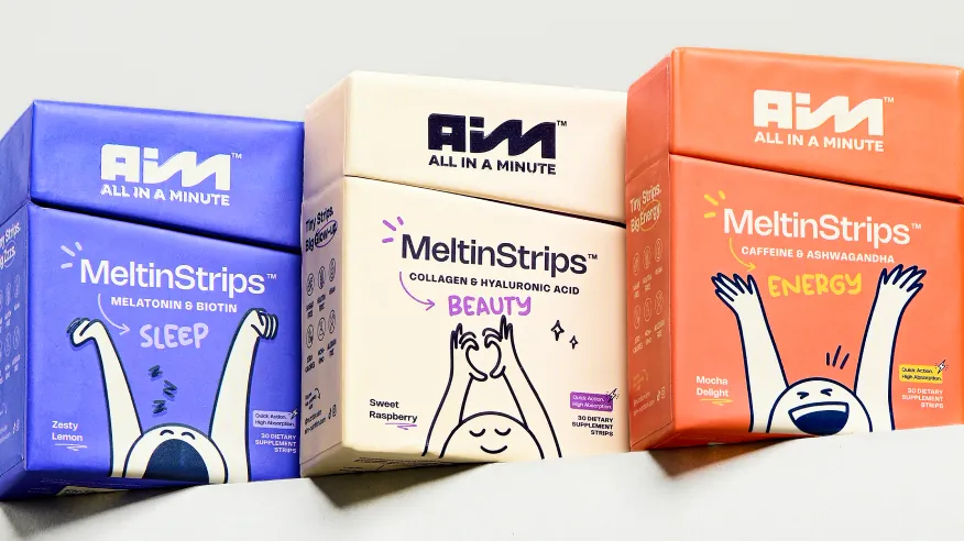
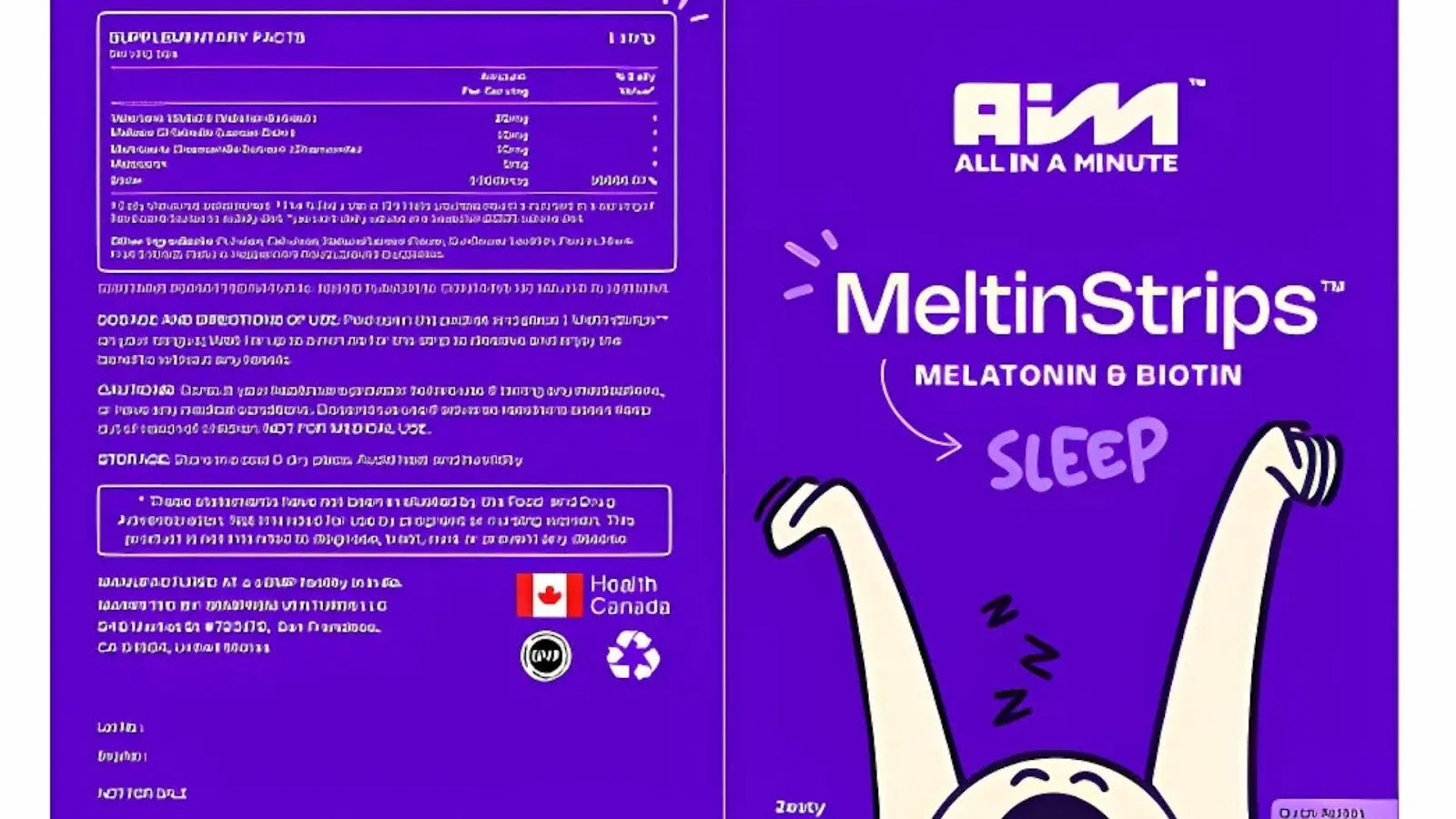
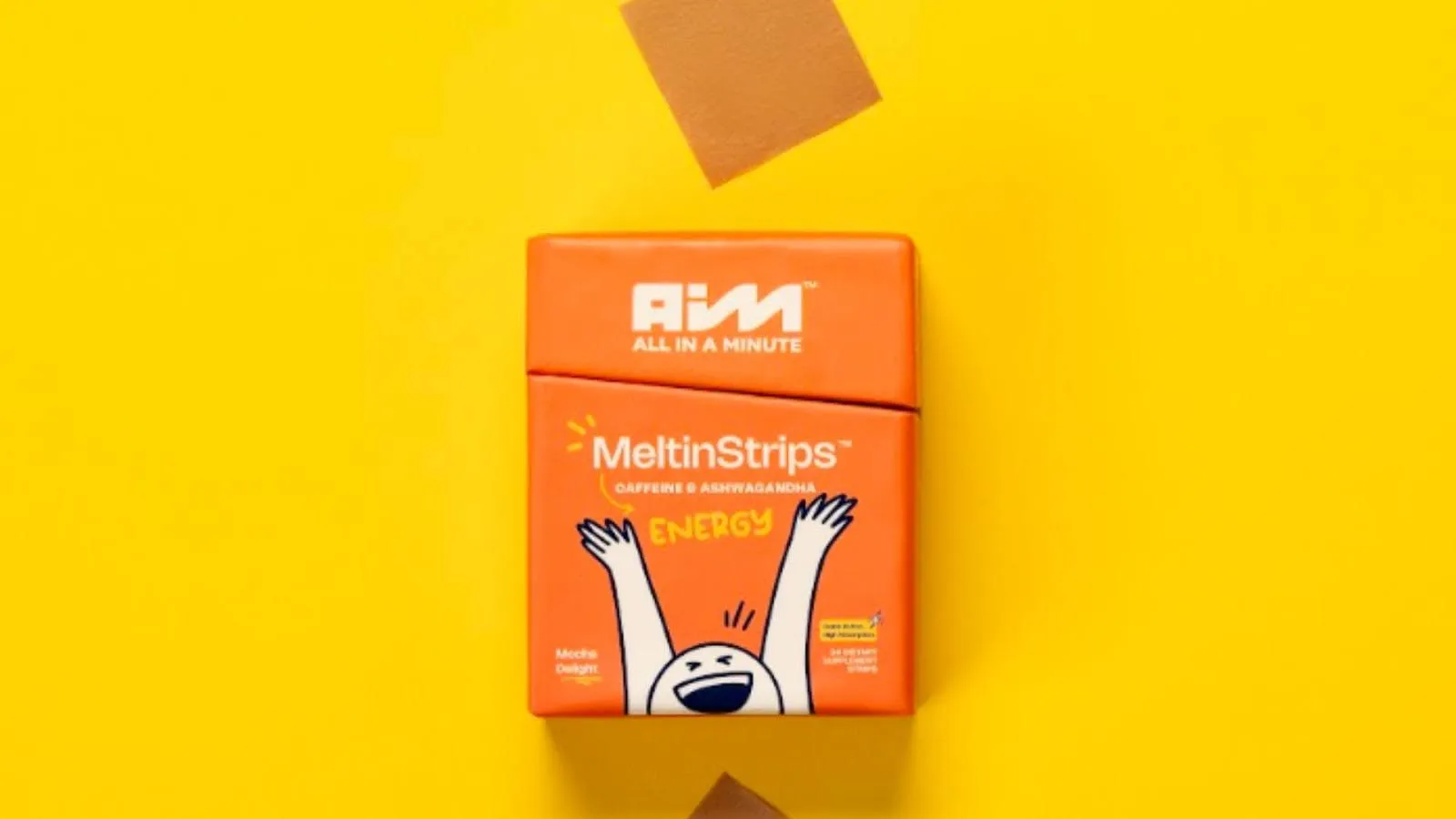
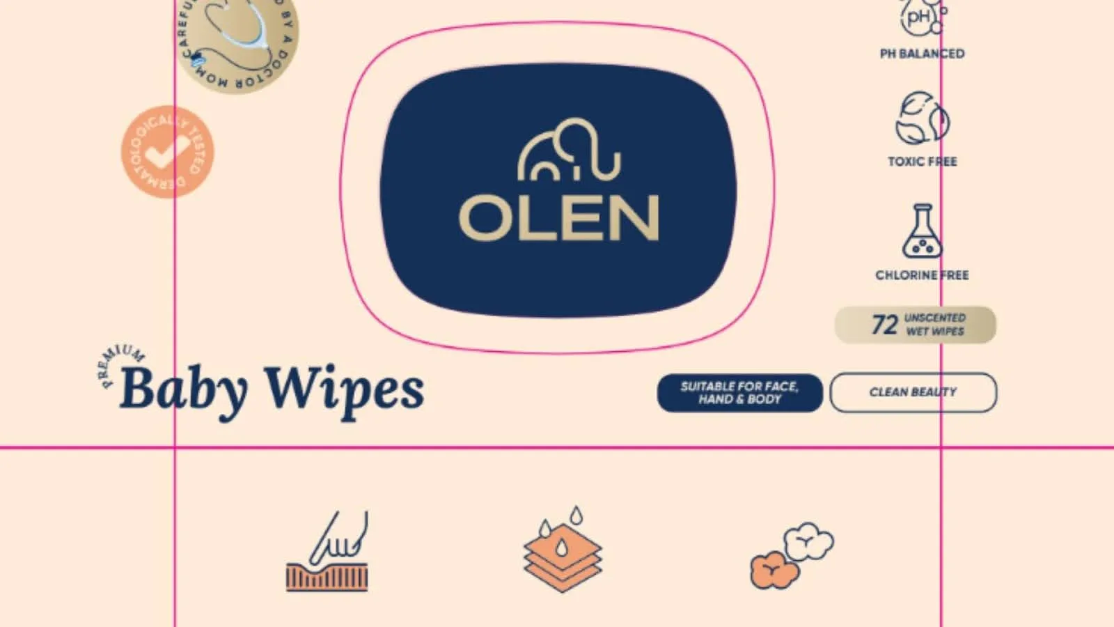
Want strategic branding and packaging like this for your business?


.webp)
.webp)


.webp)
.webp)
.webp)
.webp)
.webp)


.svg)
.webp)
.svg)
.webp)


.webp)